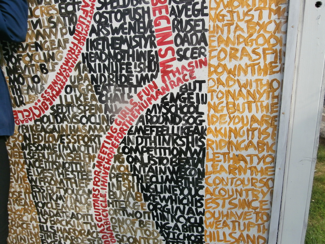
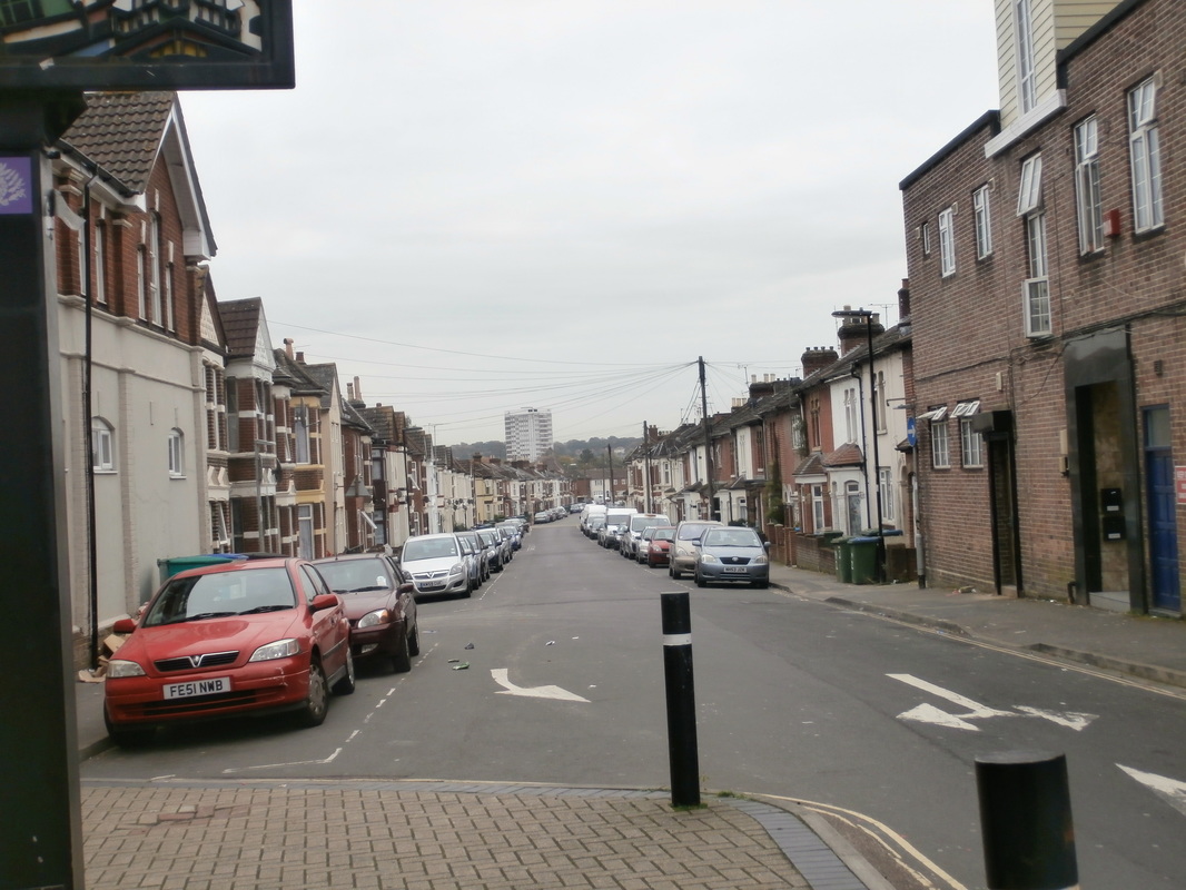
URBAN PHOTOGRAPHY.
a large amount of the worlds population live in urban surroundings. lots of photographers all around the world have been using this as inspiration and taking photographs that tell a story of a humans lifestyle. I have decided to look at the topics of urban landscape using 3 starting point, abstract, repetition, and capturing the moment.
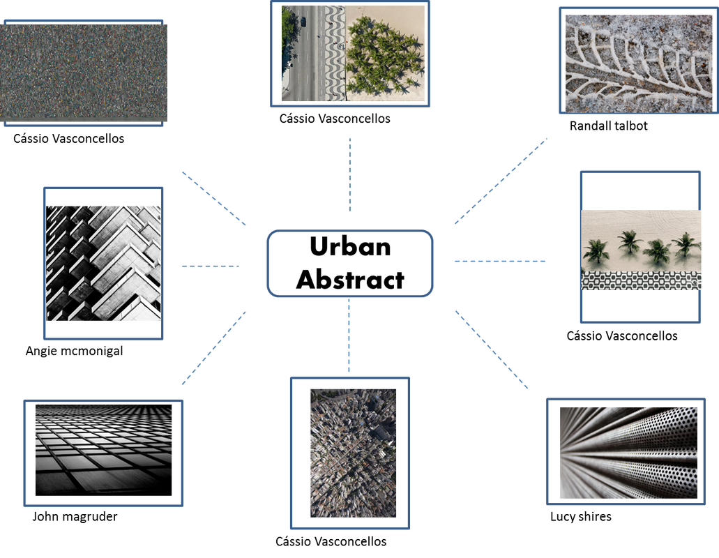
My response to abstract
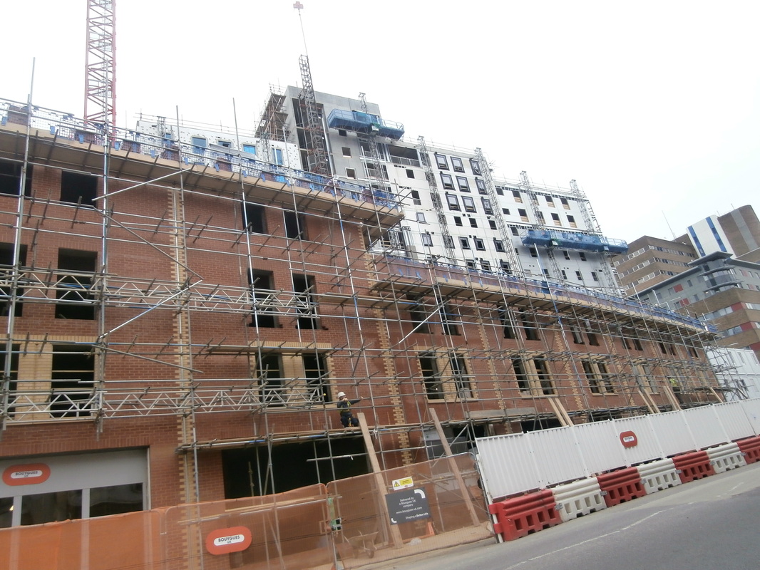
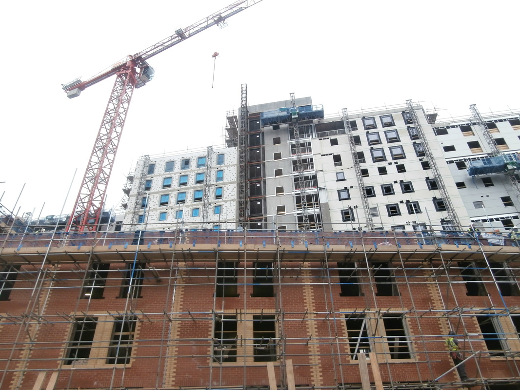
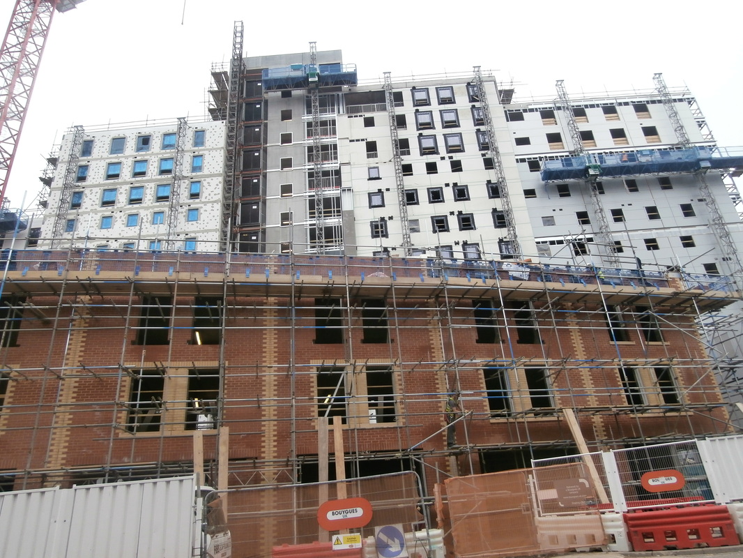
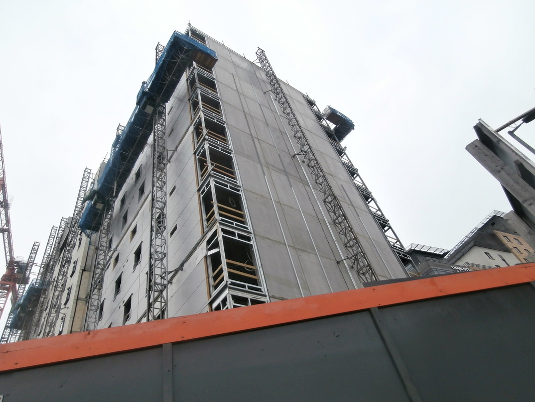
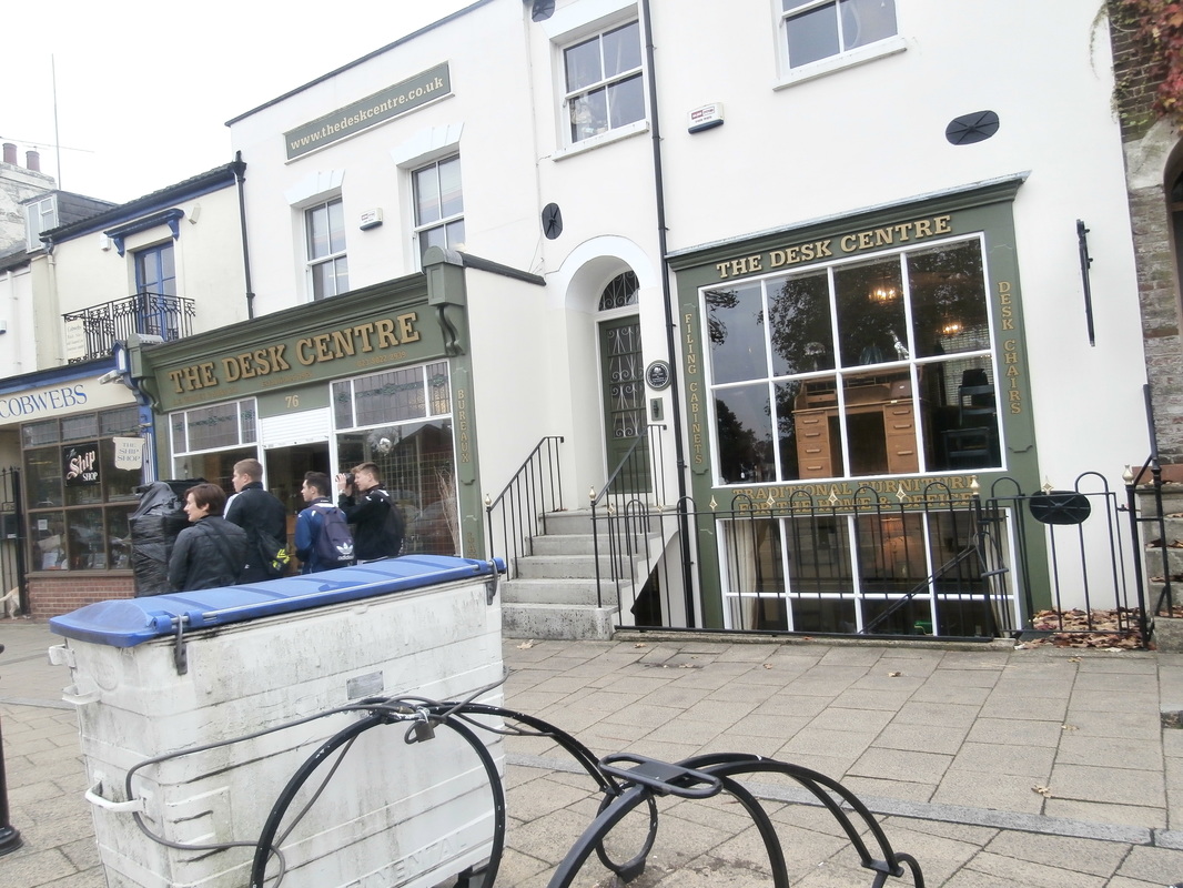
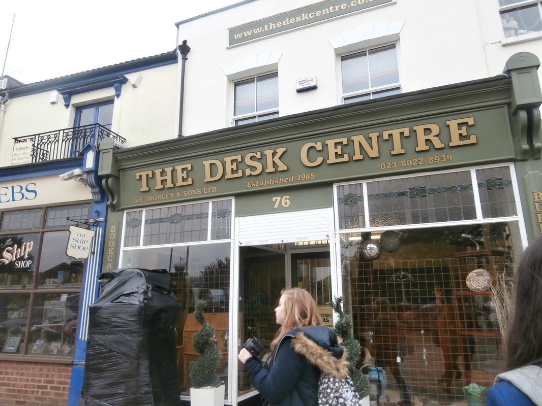
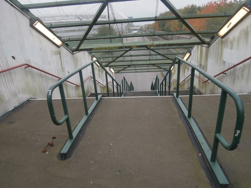
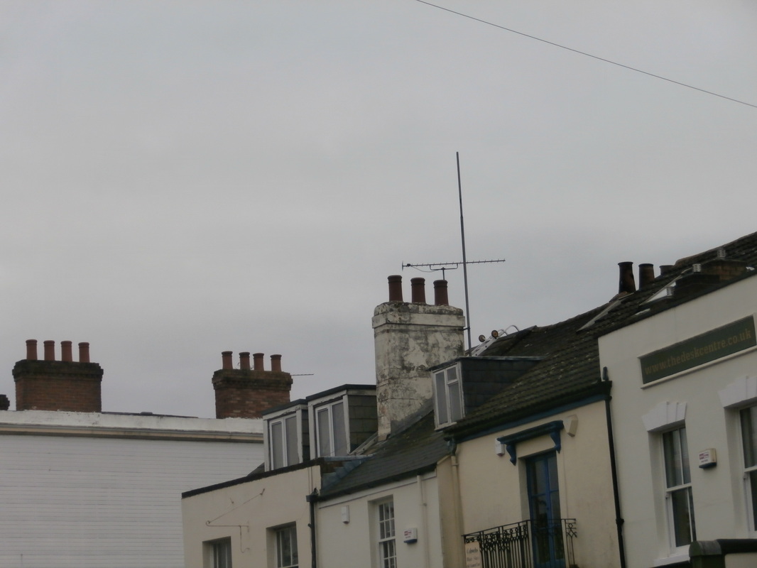
Abstract City Centre.
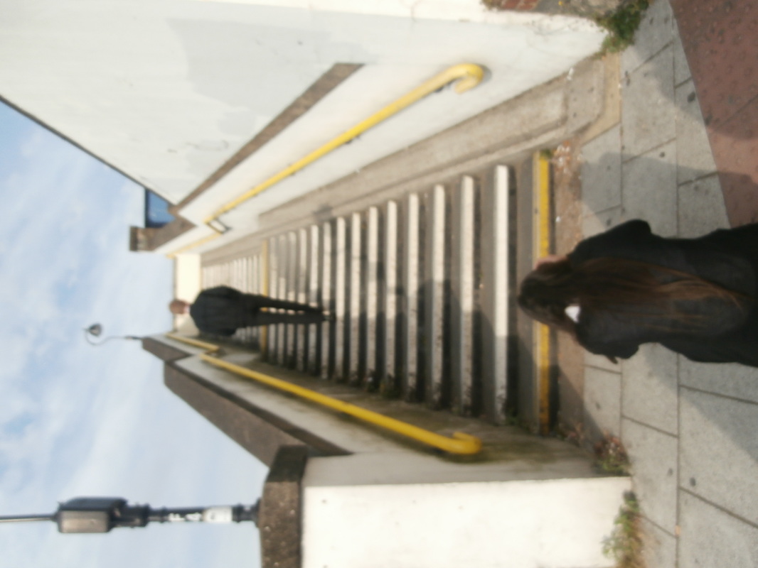
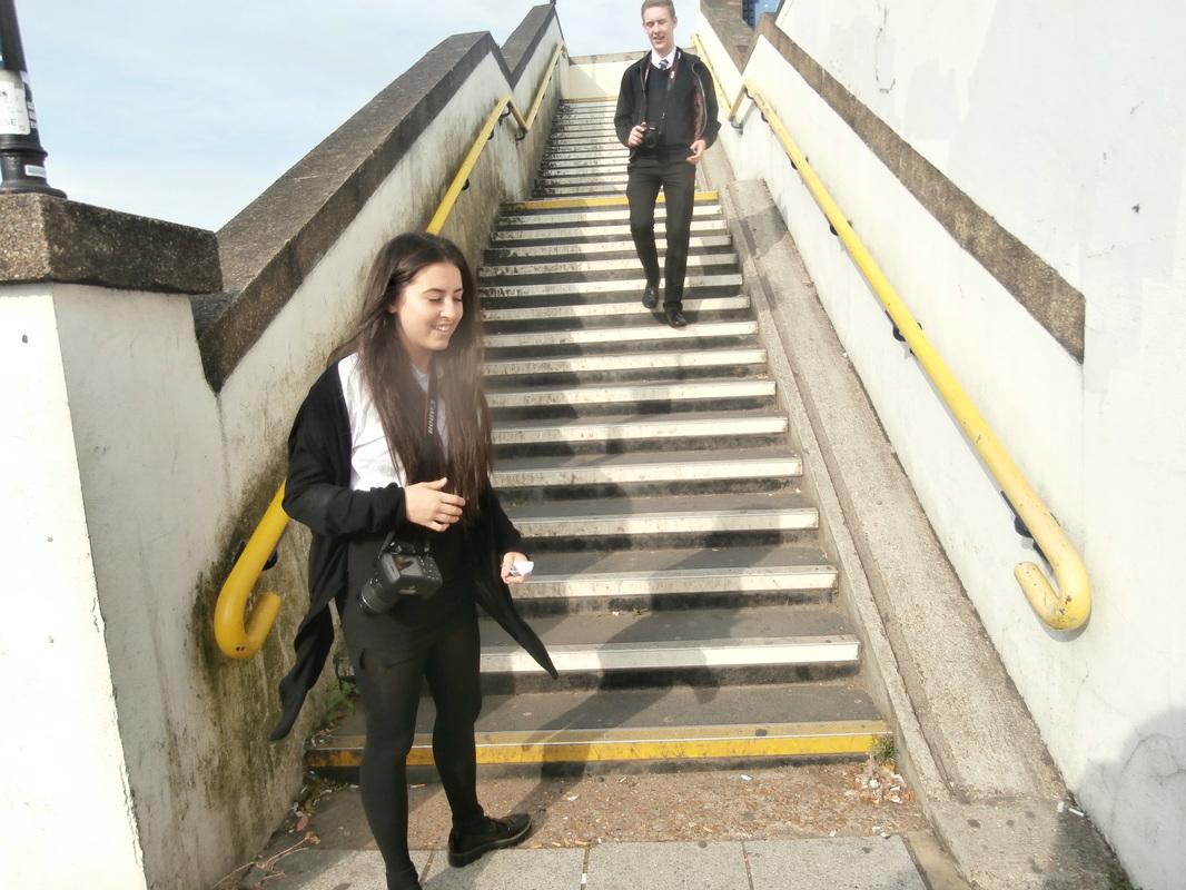
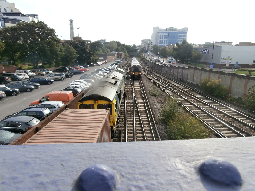

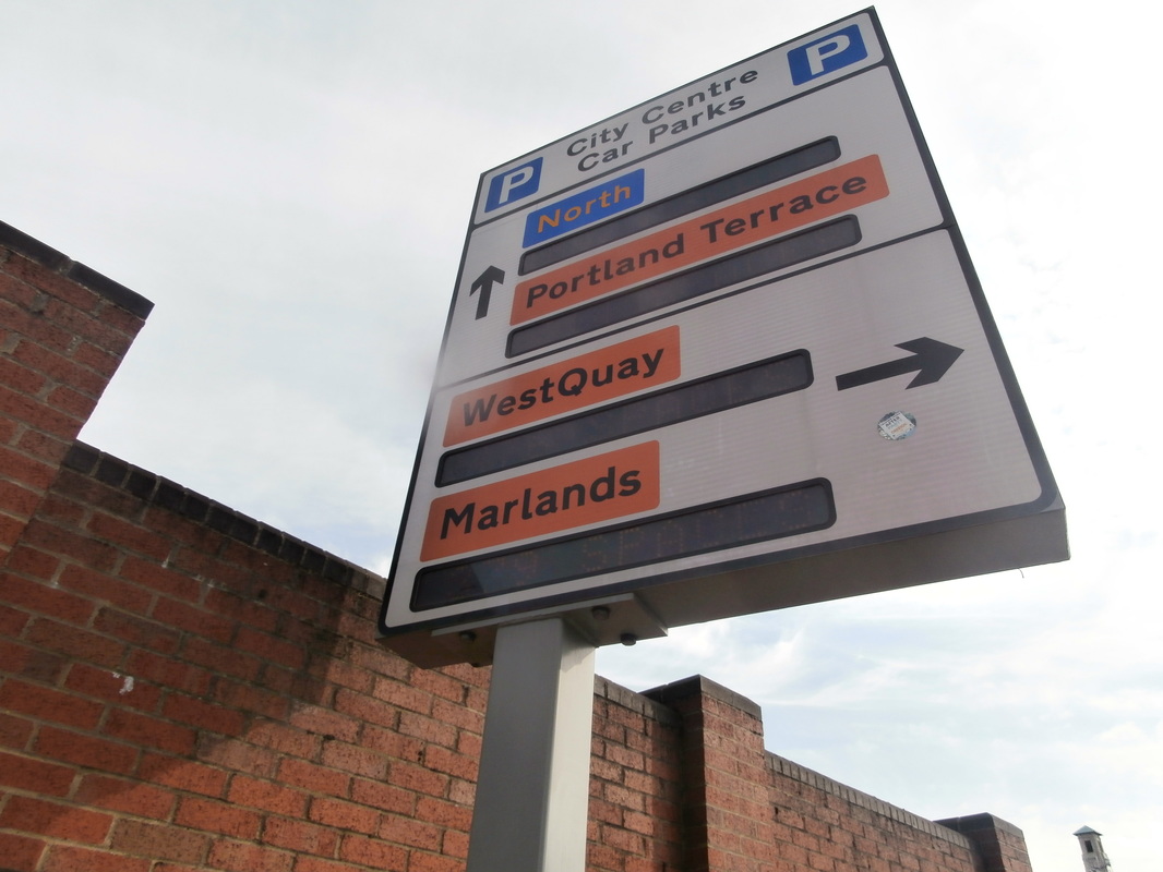
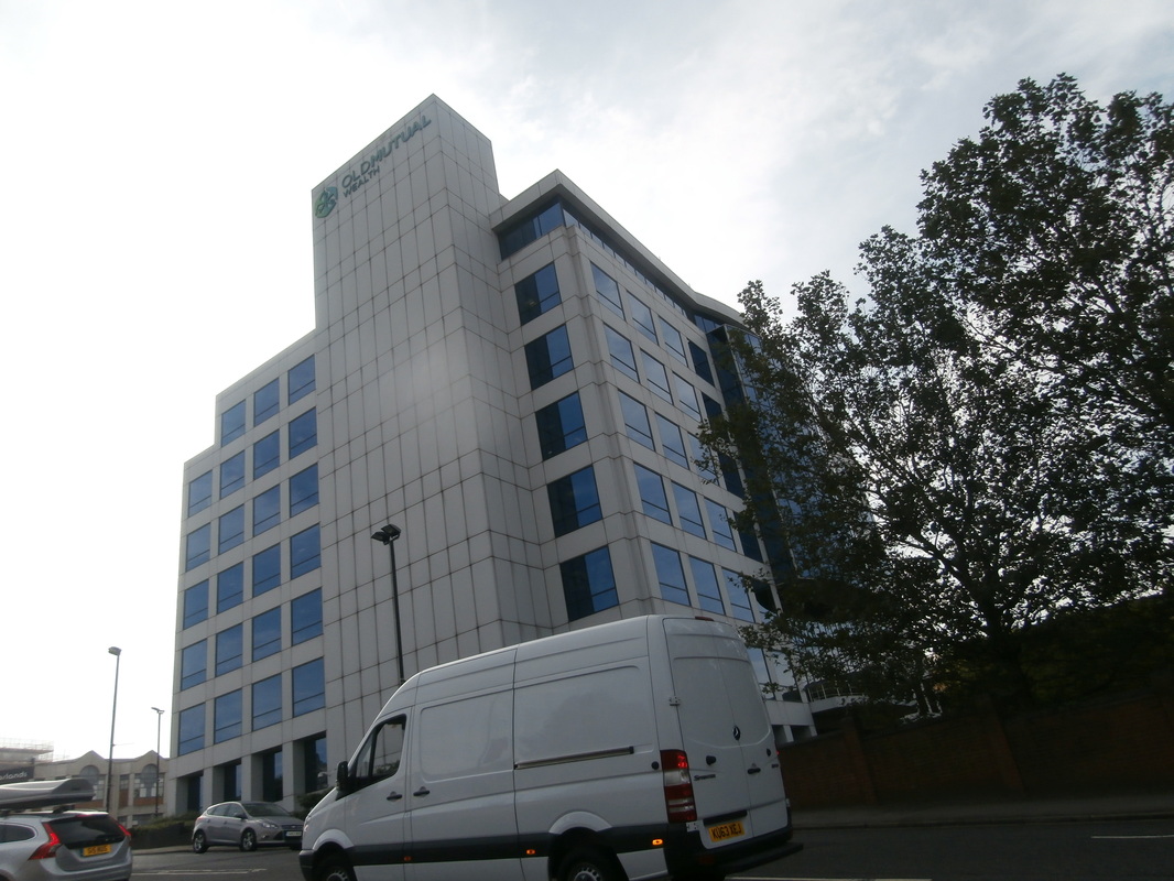
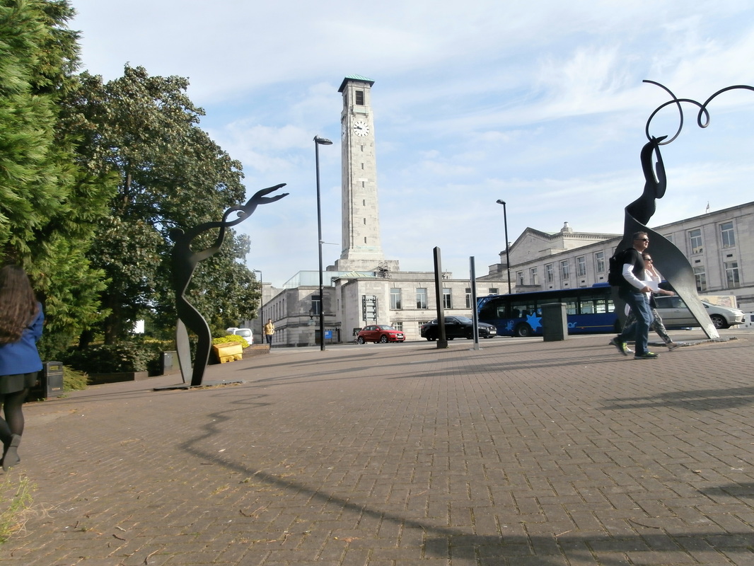

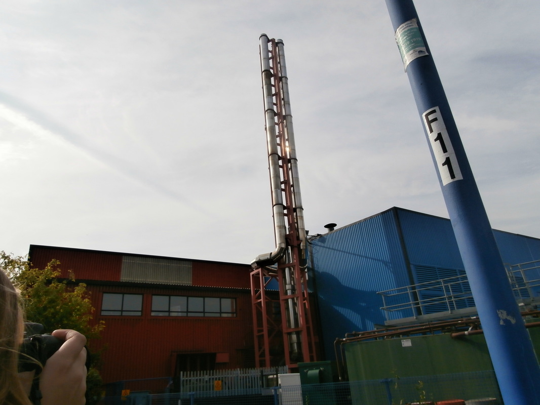
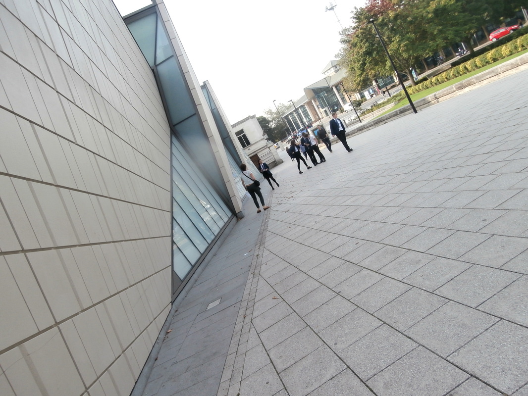
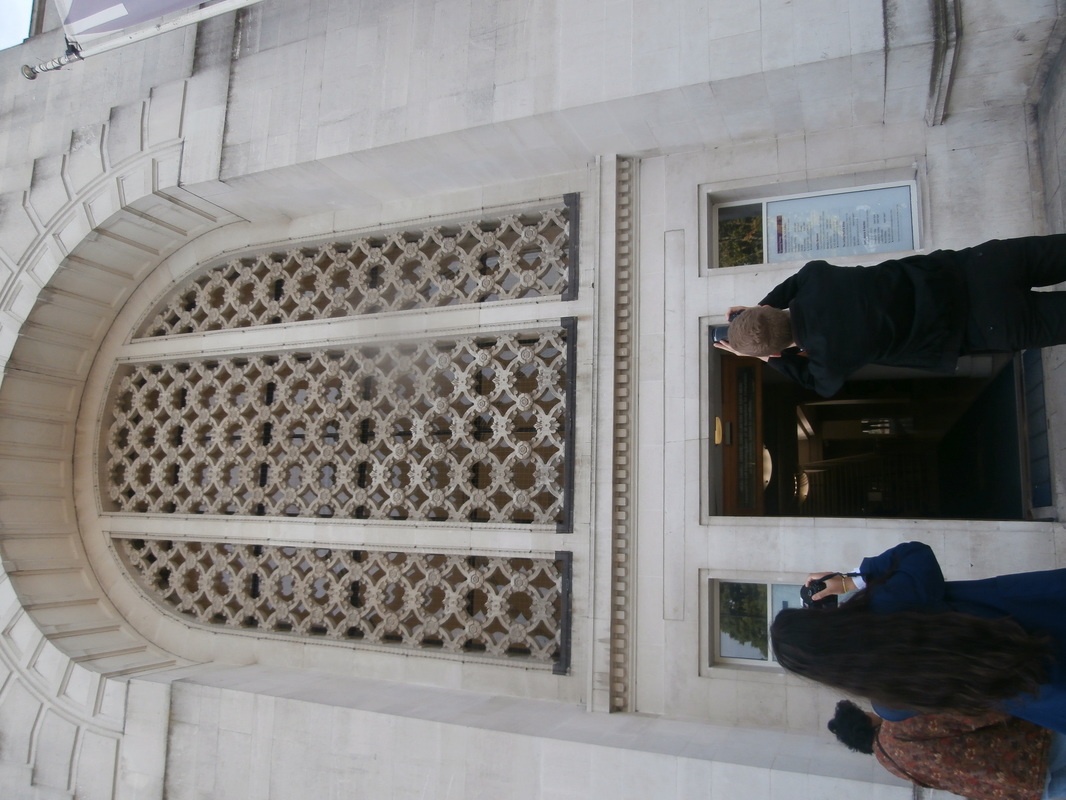

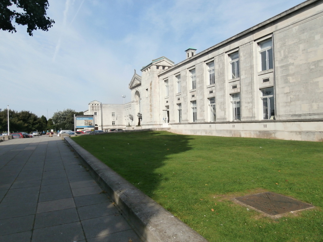
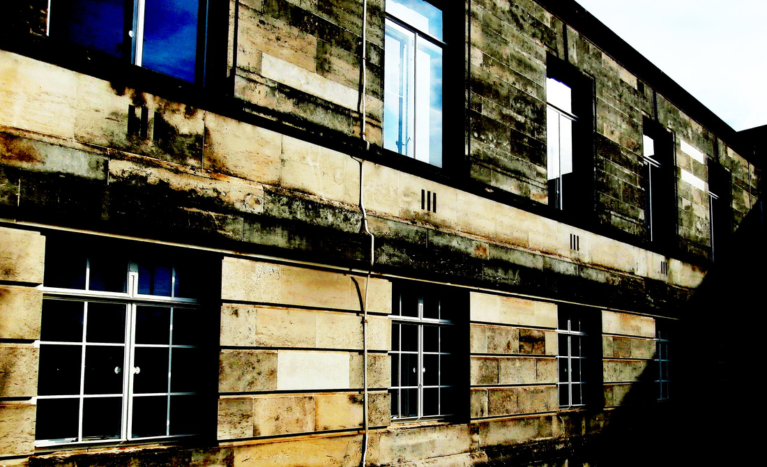
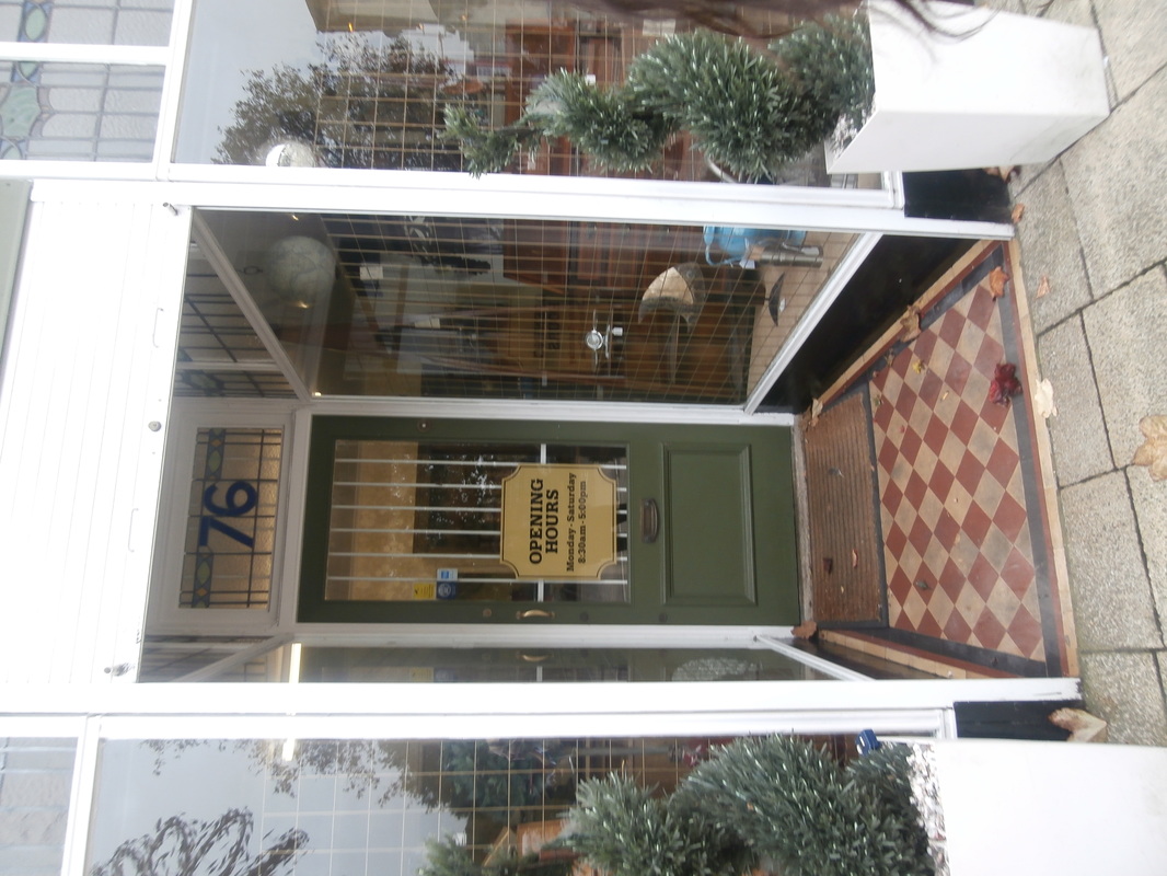
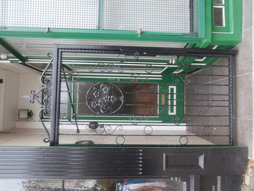
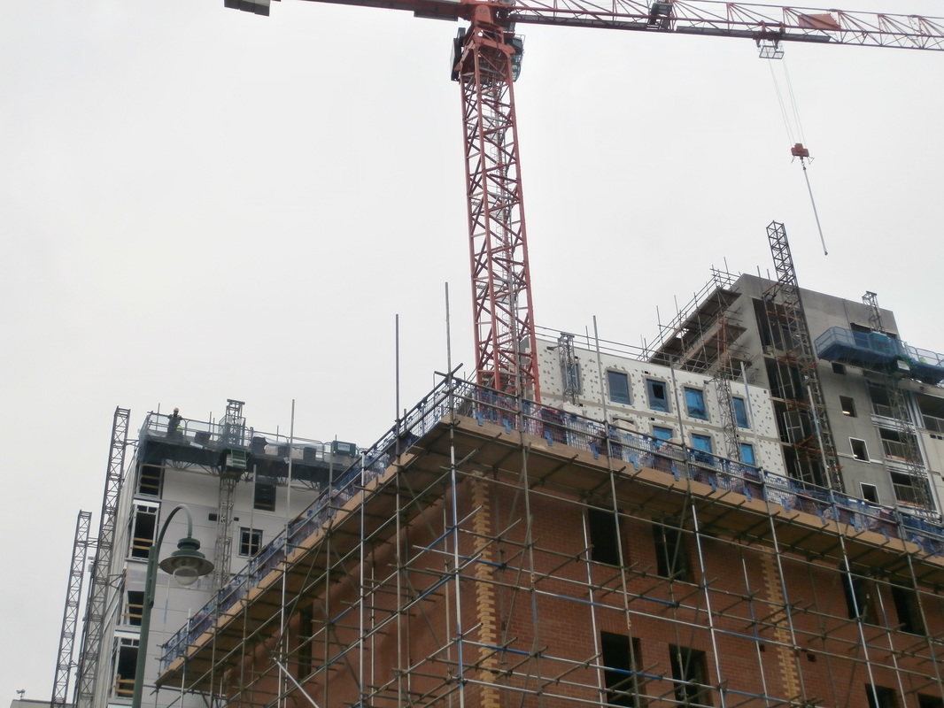
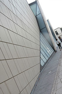
Photoshoot - viewpoints.
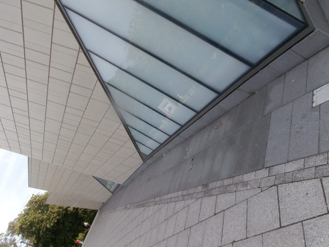
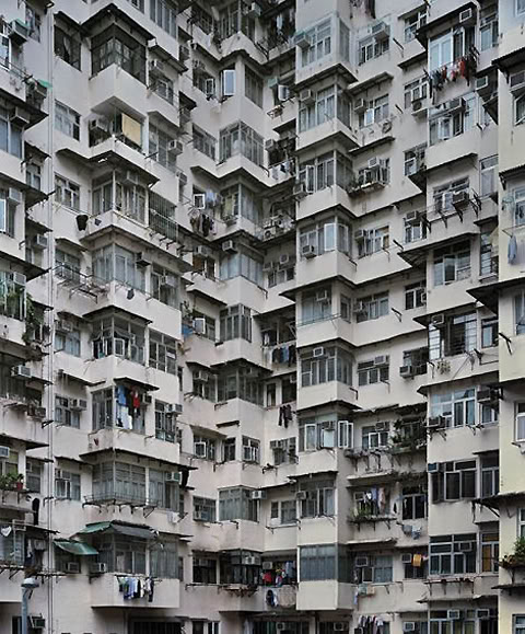
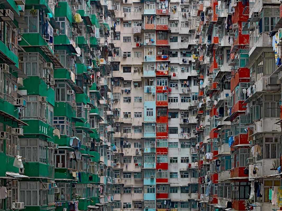
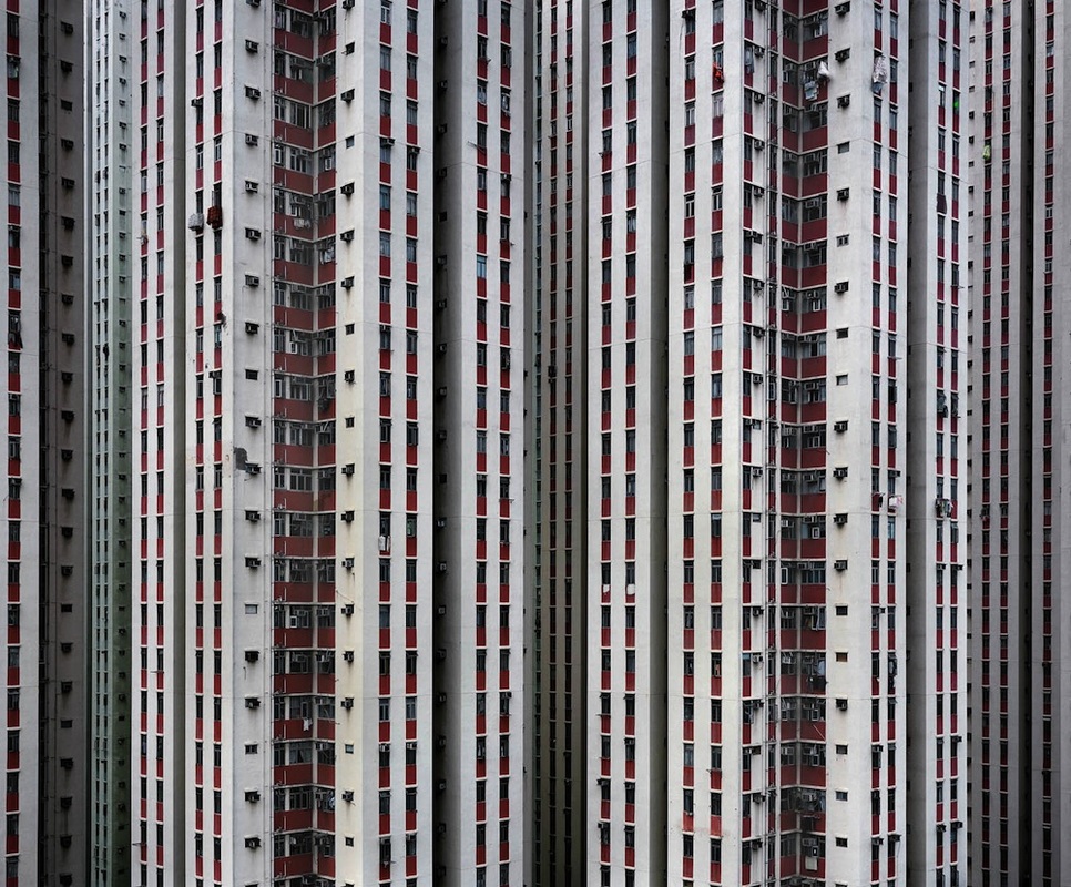
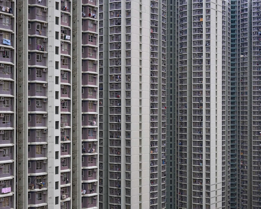
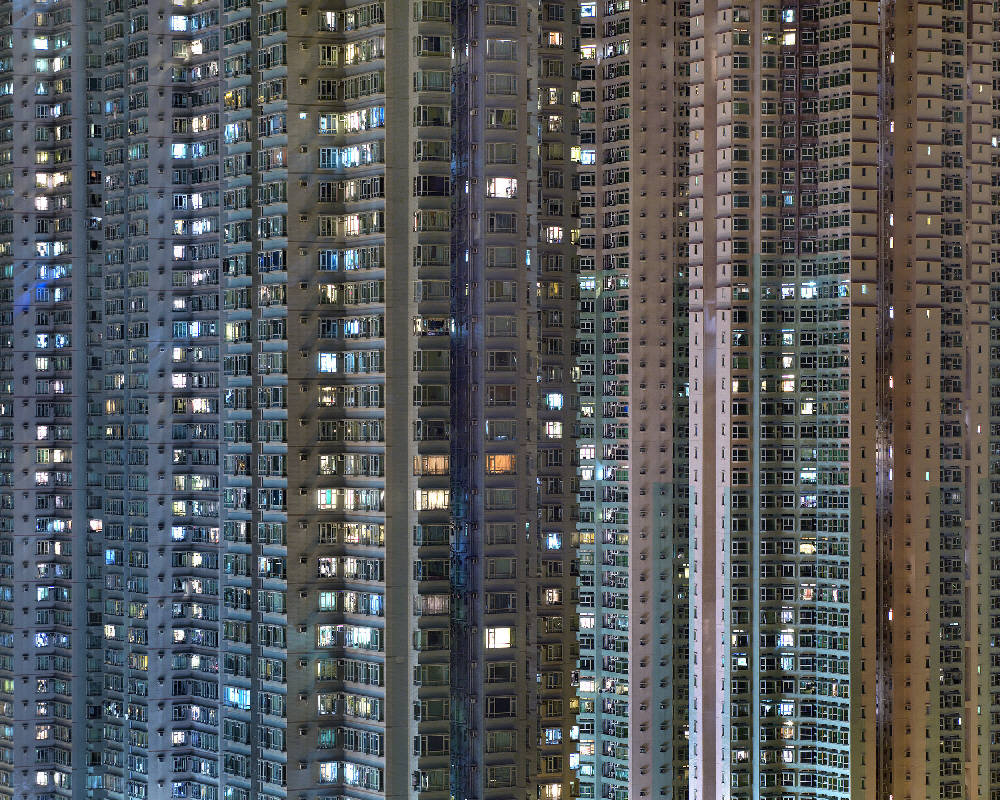
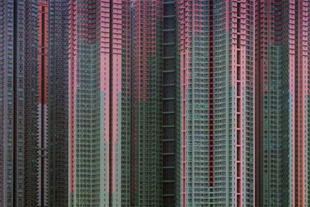
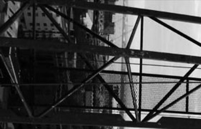
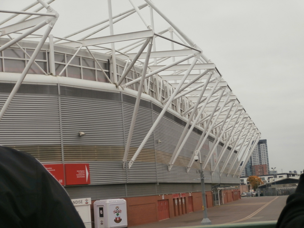
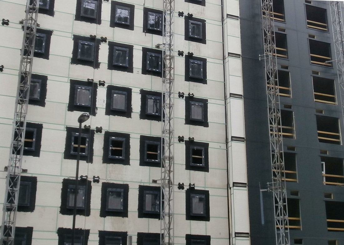
Michael Wolf.
Michael Wolfs' work is very original and unique, he normally takes photos of cities and buildings. the photos he takes have many lines, angles and squares, the lines are bold and lead to one point, lines of direction. Michael takes photos with natural lighting, they aren't staged so he has to capture the moment. Sometimes he will take photos and crop the image closely to focus on a certain part of the image. The photos don't have much colour as buildings are usually dull and dark colours, they are reflective and look metallic.
My response to Michael Wolf


Refining my response to Michael Wolf
|
|
|

|
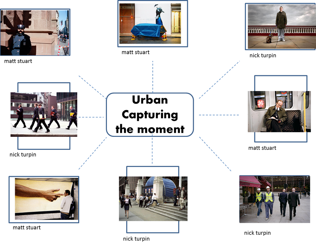
My response to capturing the moment
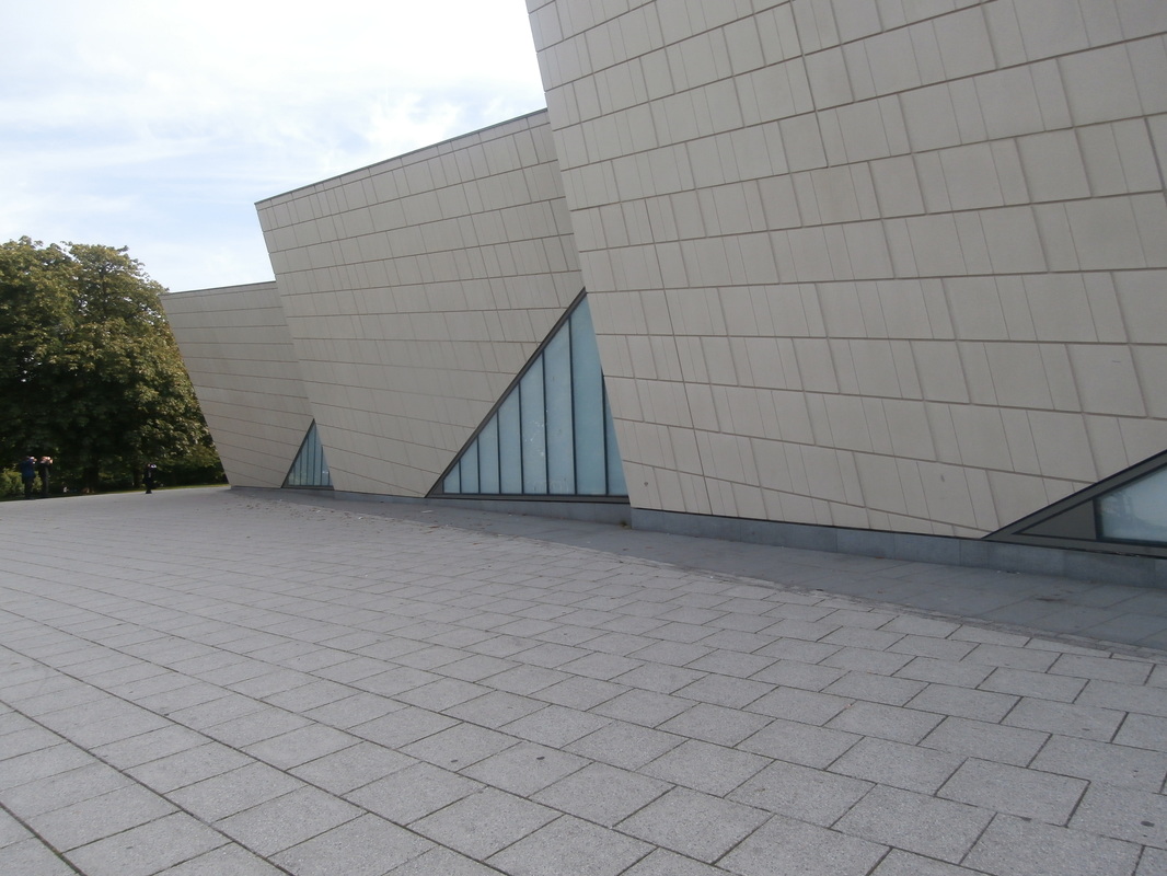
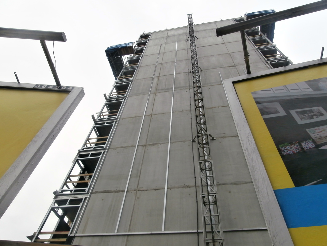
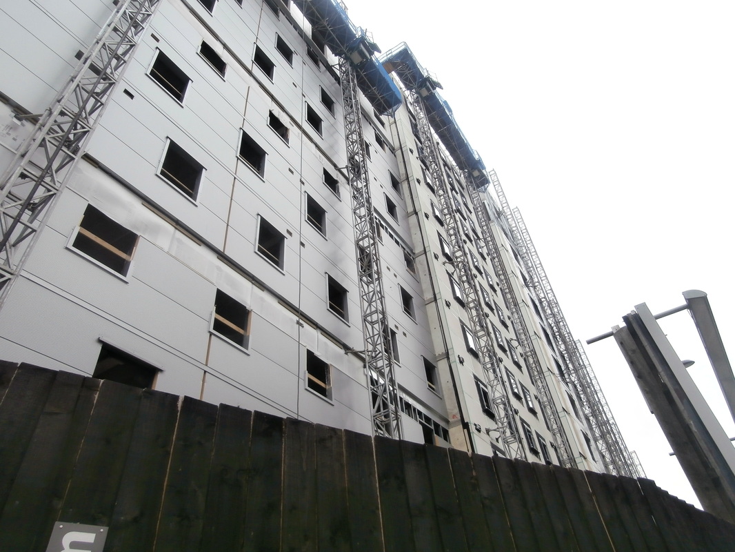
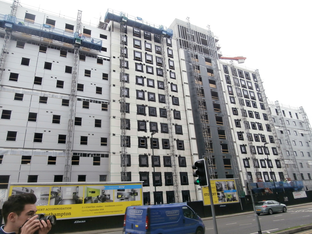
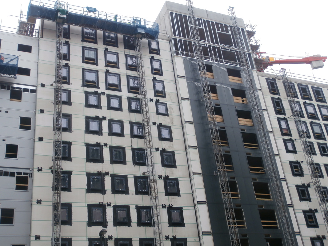
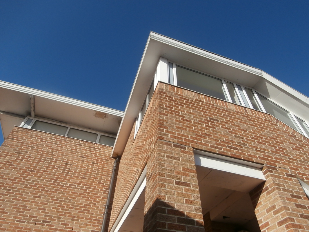
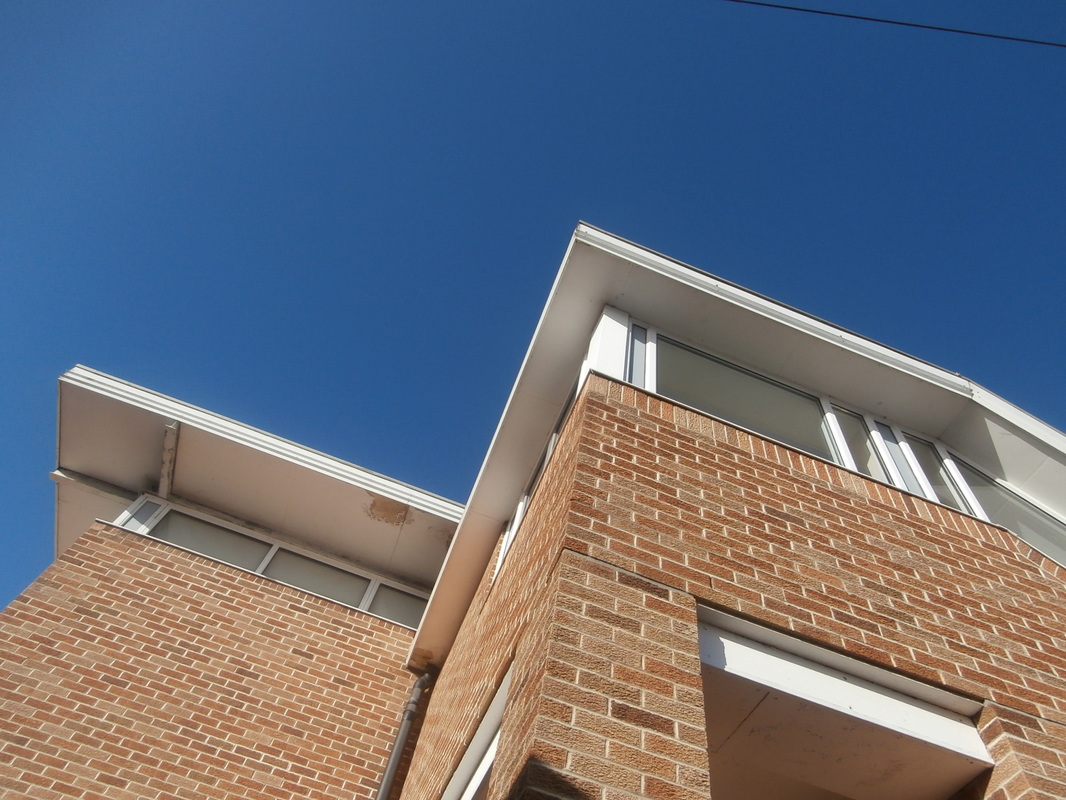
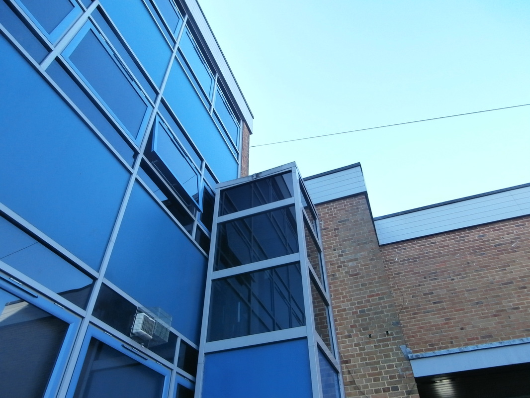
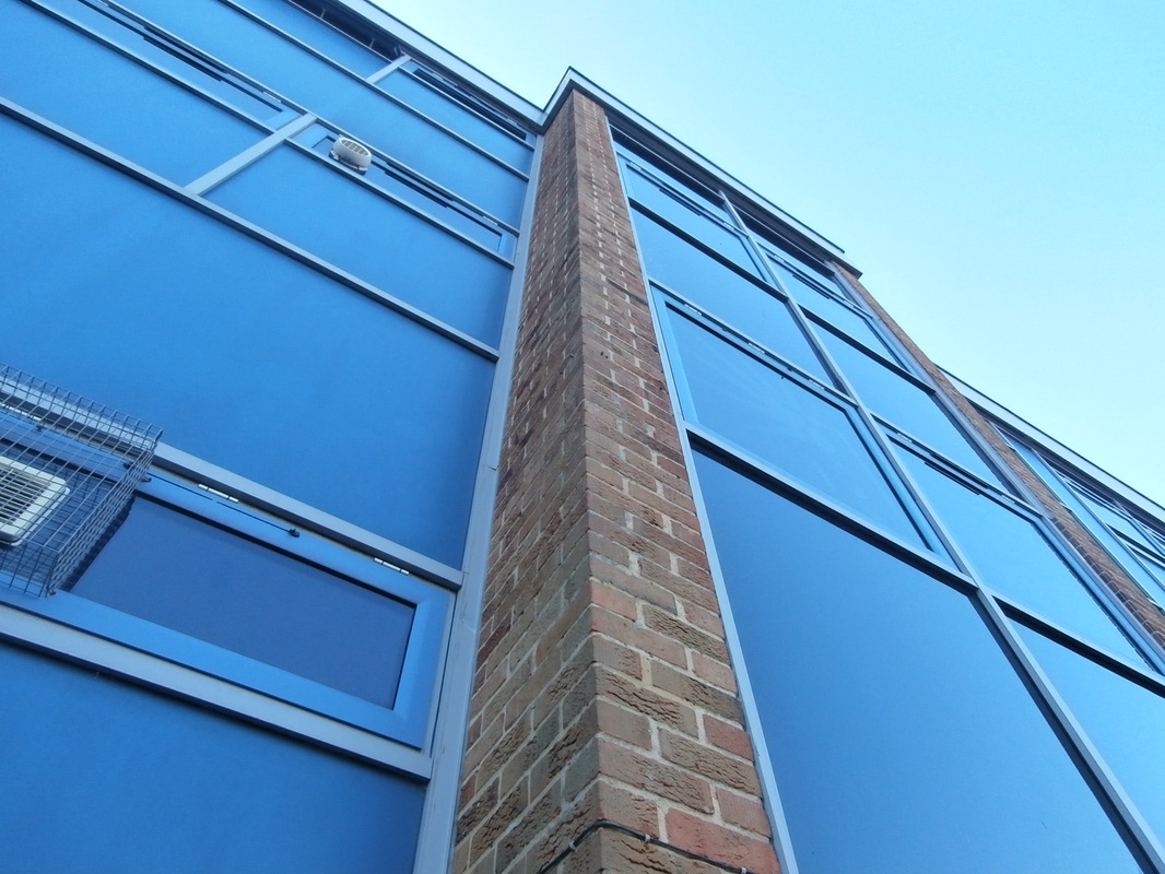
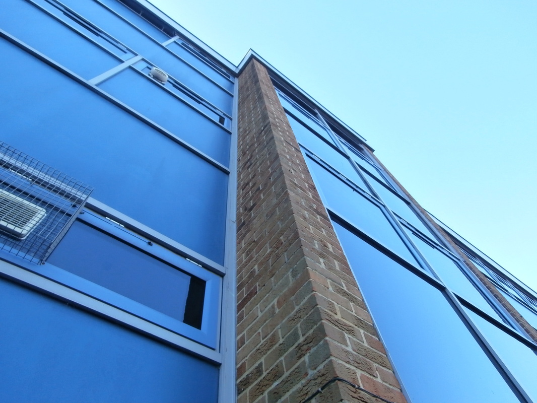
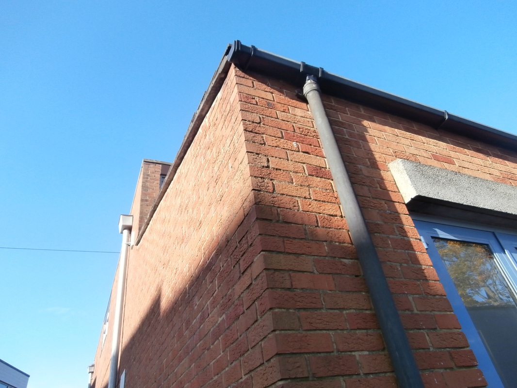
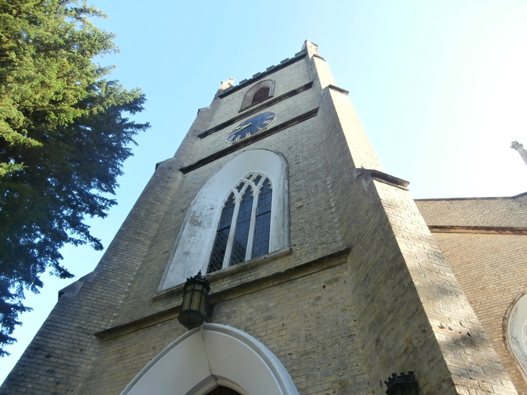
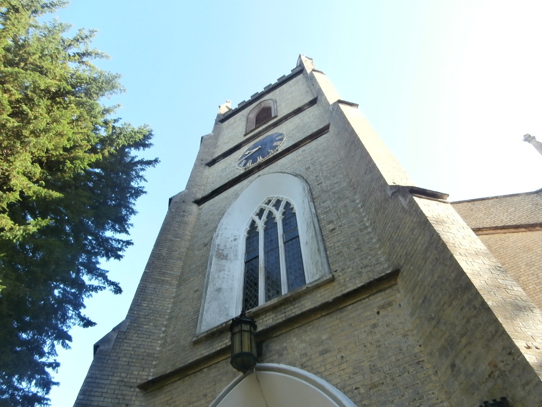
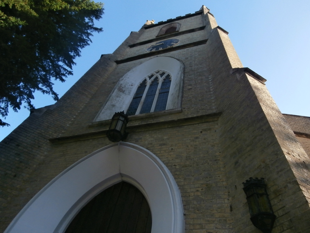
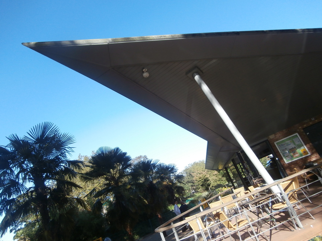
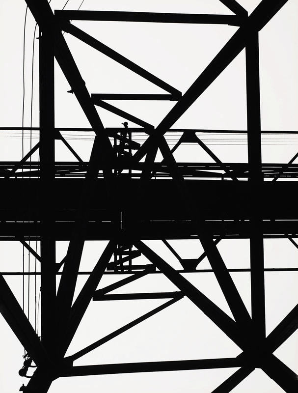
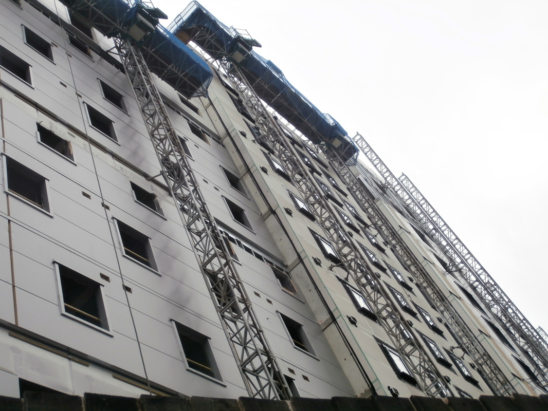
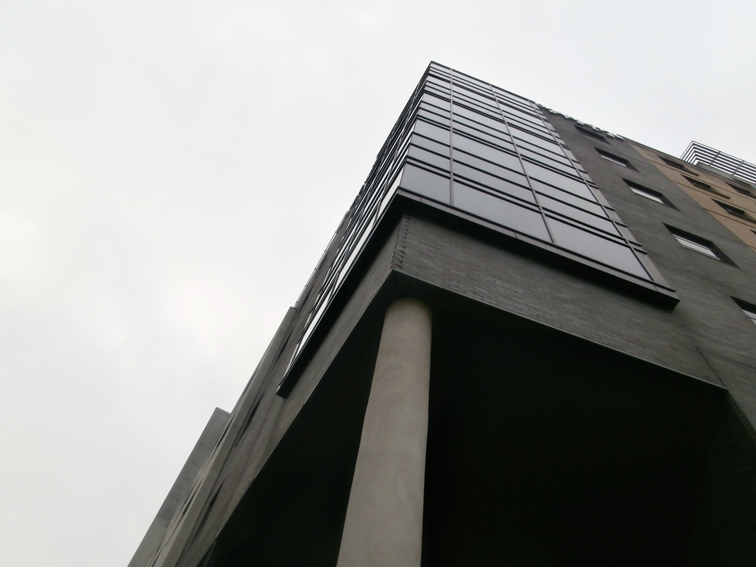
Moholy-Nagy.
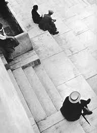 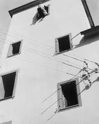 |
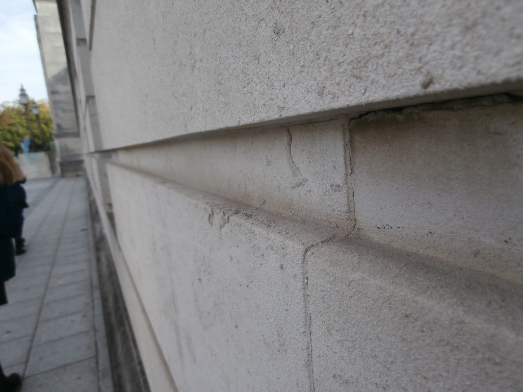
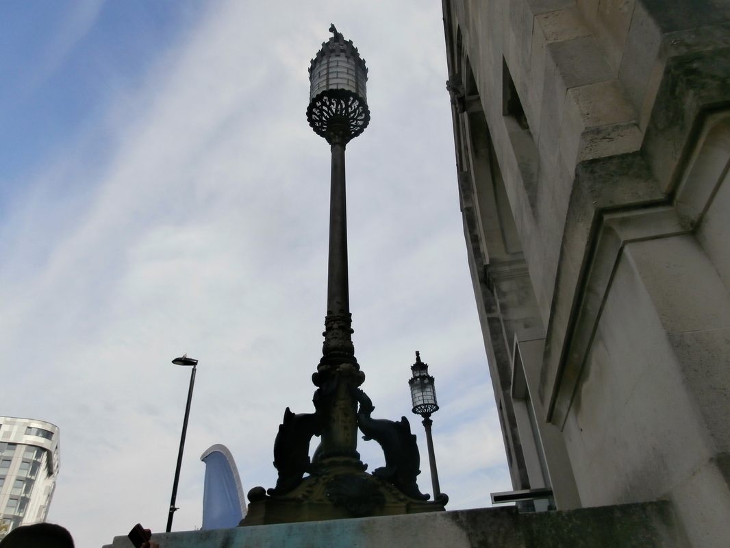
Moholy-Nagy liked taking photos of buildings close up from the ground looking up. He chose simple, modern looking buildings. he often used a person to show the size and shape of things.
|
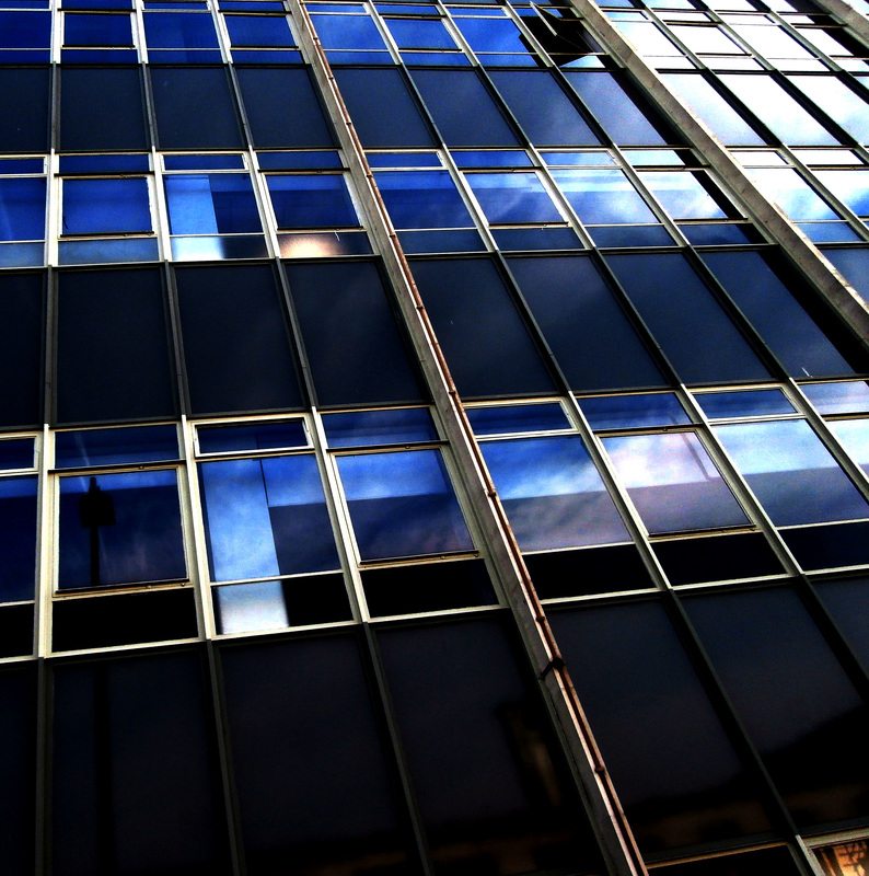
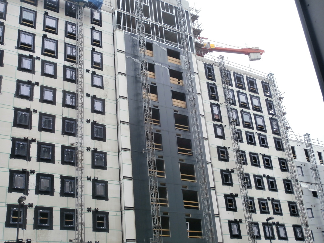
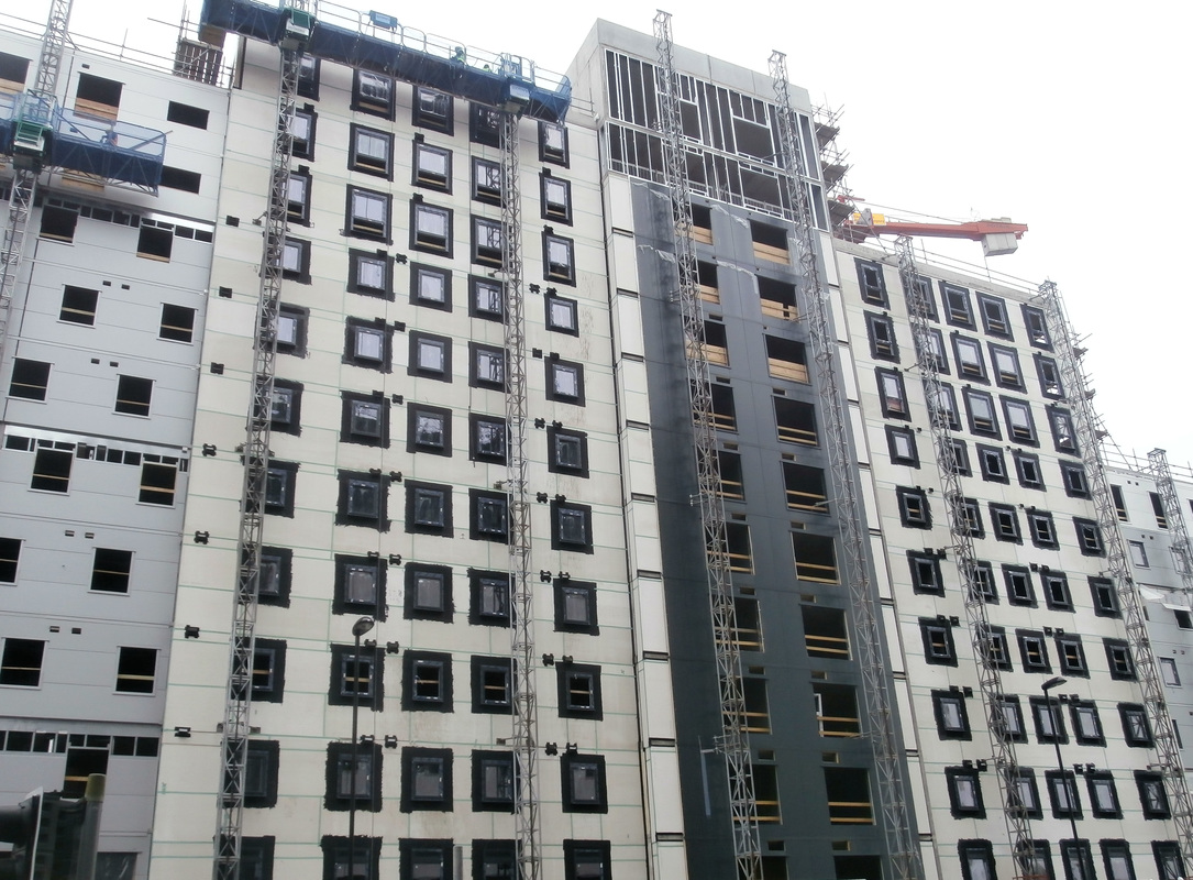
My response to looking up
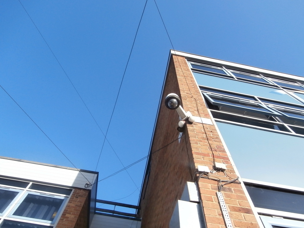
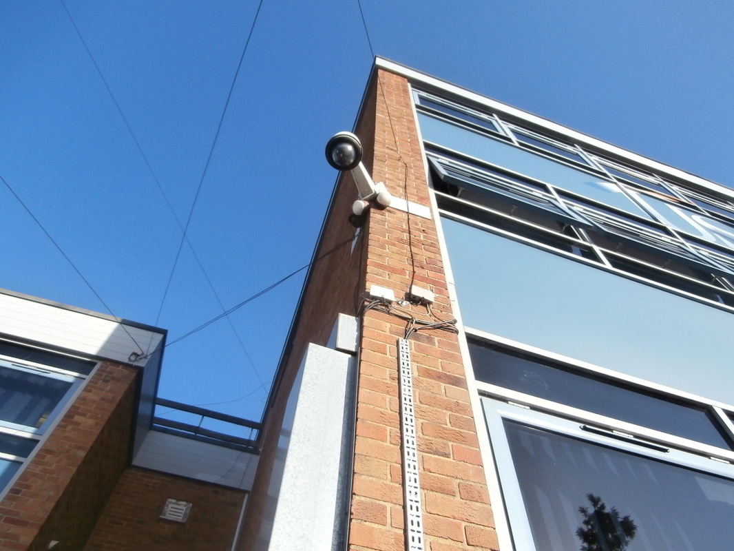
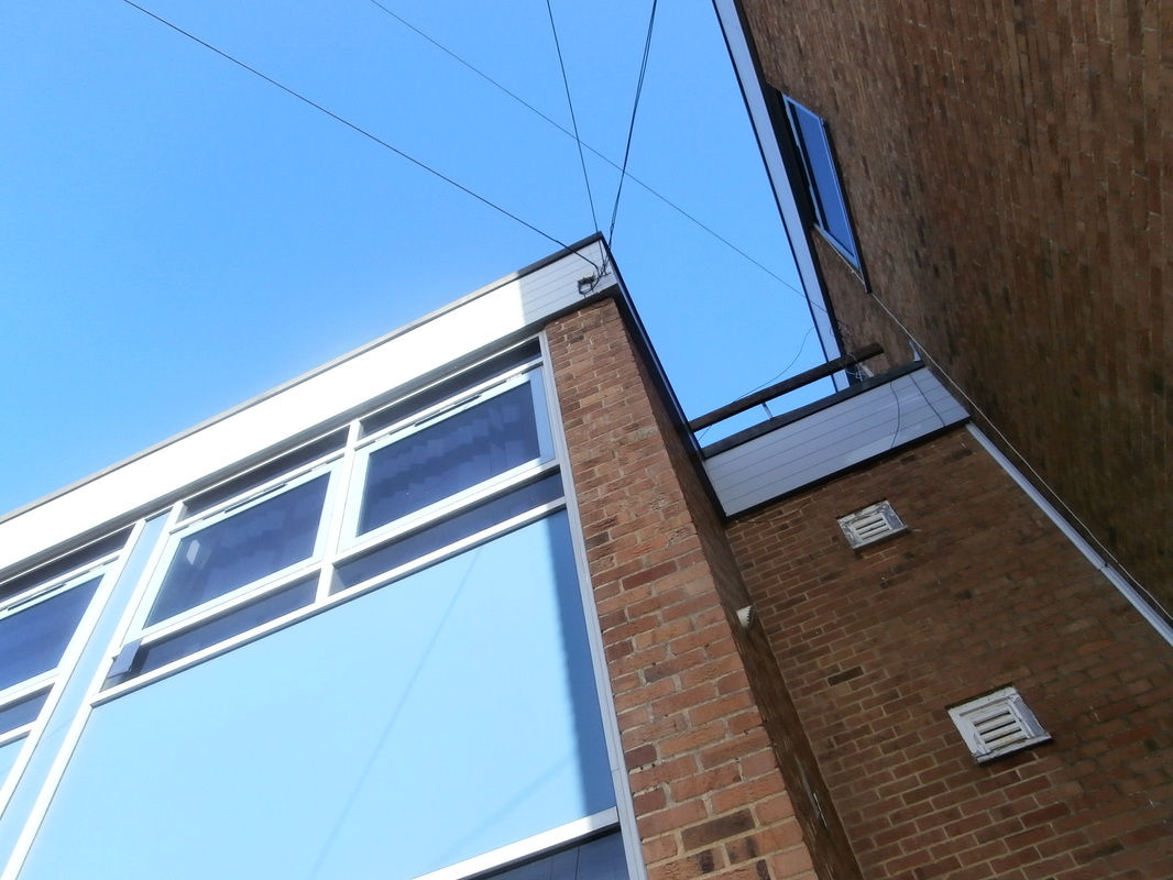
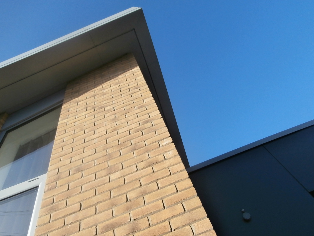
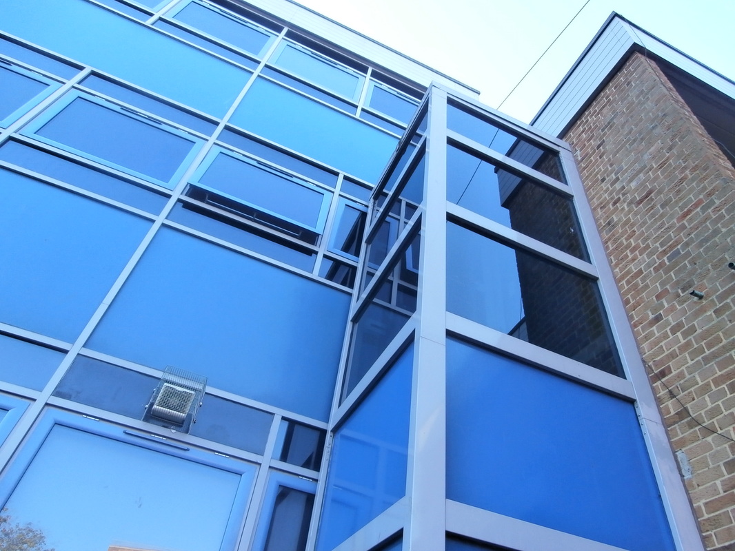
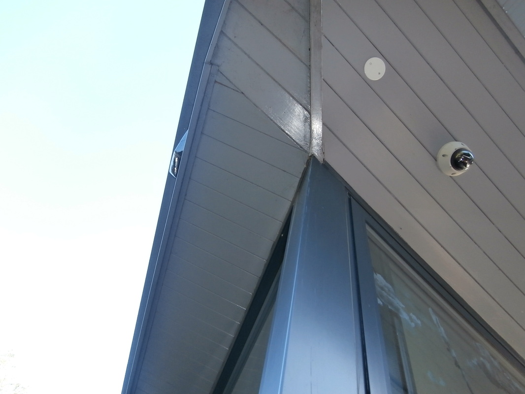
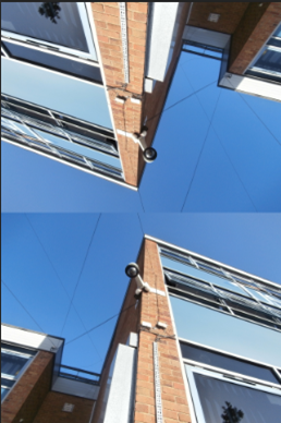
Editing looking up

|
|
|
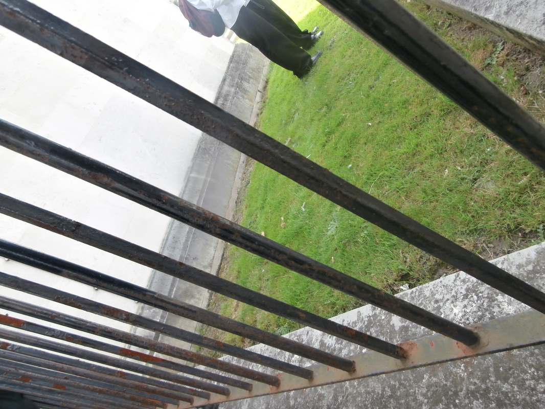
Analysing using formal elements- Paul Strand.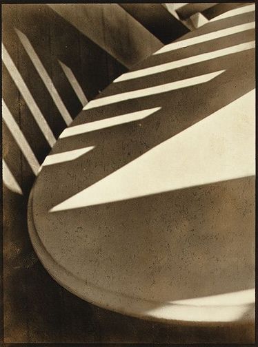
|
Focus: most of the image is crisp and clear and there's slightly less focus towards the bottom of the photo, it looks like the edge of a table top.
Light: the shapes of bright sunlight in the middle of the photo appear to maybe be coming from the slats in a wooden chair. Line & shape: there are lots of strong lines, one curvy going through the middle of the photo but mostly straight. There is also a large triangular shape near the middle. Repetition: the rectangles of sunlight running across the surface are very repetitive. Space: the space in the image seems quite tight, it looks cropped. we don't see any whole objects just part of them. Texture: some of the objects in the photograph look flat and smooth, however the edges of the rectangles look sharp and pointed. Value and tone: the photo has lots of different tones from very light to very dark. there are dark shadows but also mid tones. The whole photo has a brownish looking tint. |
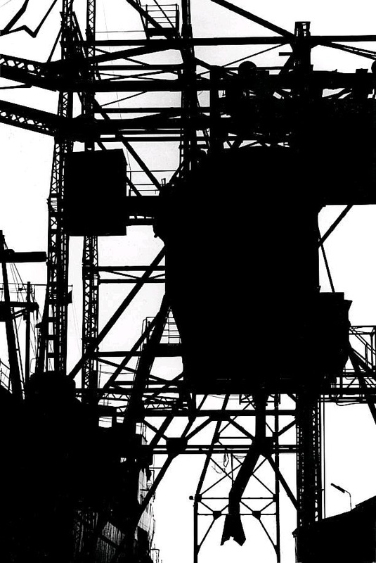
Keld Helmer Peterson.
|
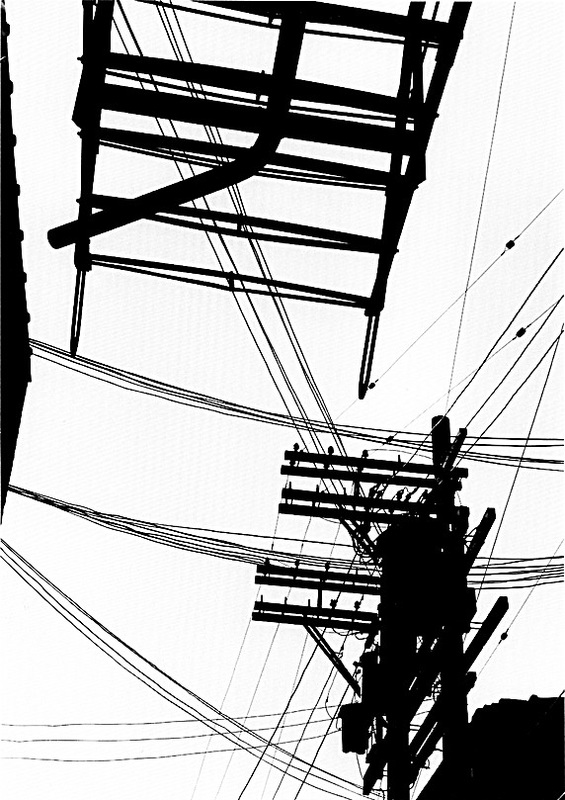
The silhouettes look dark, Peterson has focused on the lines and shapes overlapping so it makes the photographs bold. the photos also show the urban environment. I am inspired by this approach and I will use the elements of line and contrast.
|
|
My response to Peterson.
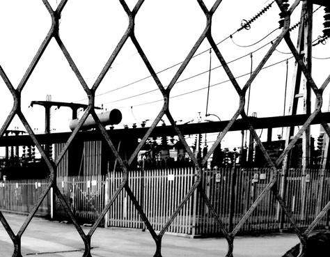
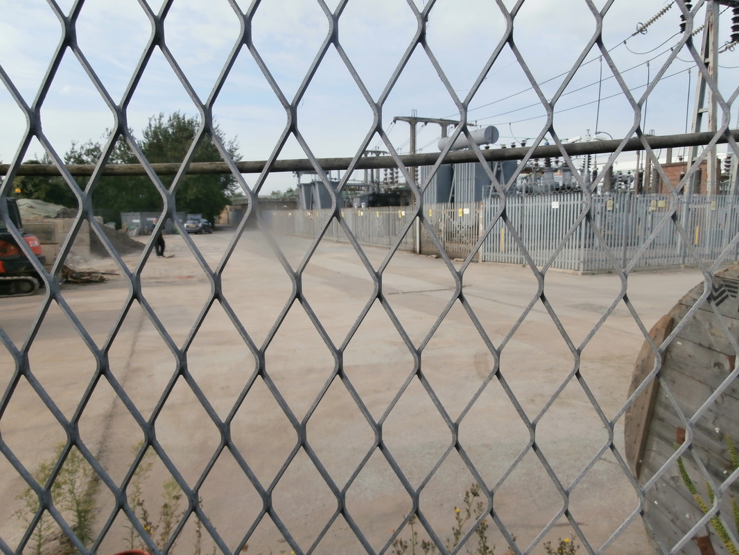
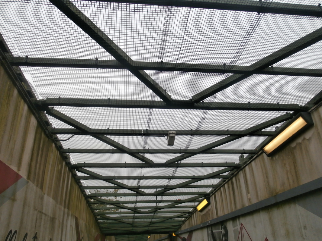
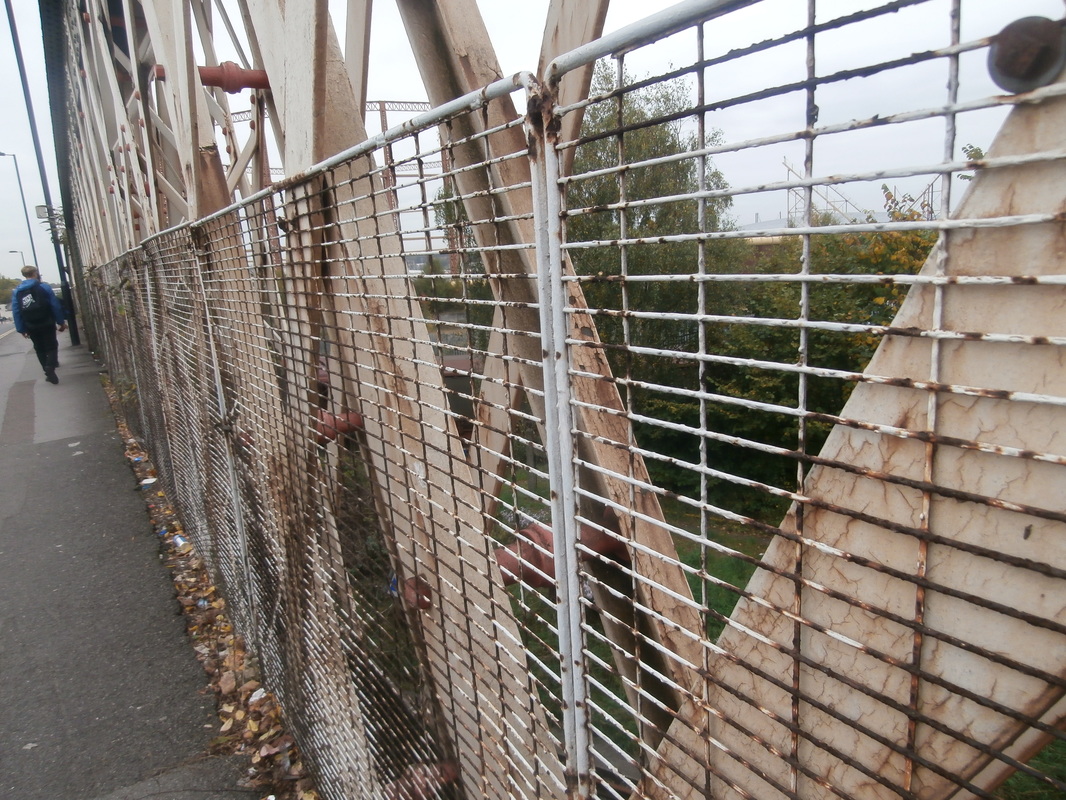
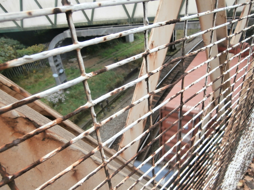
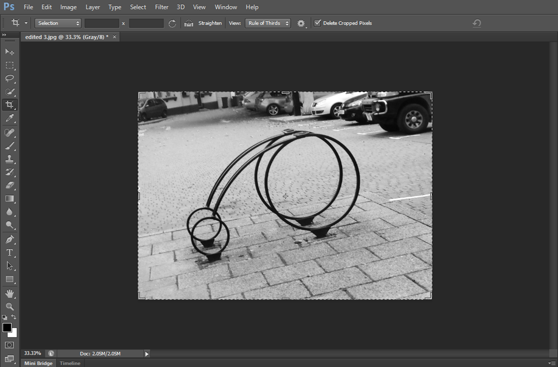
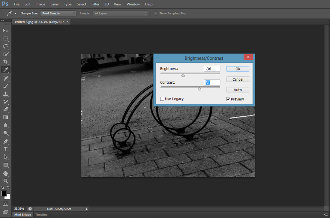
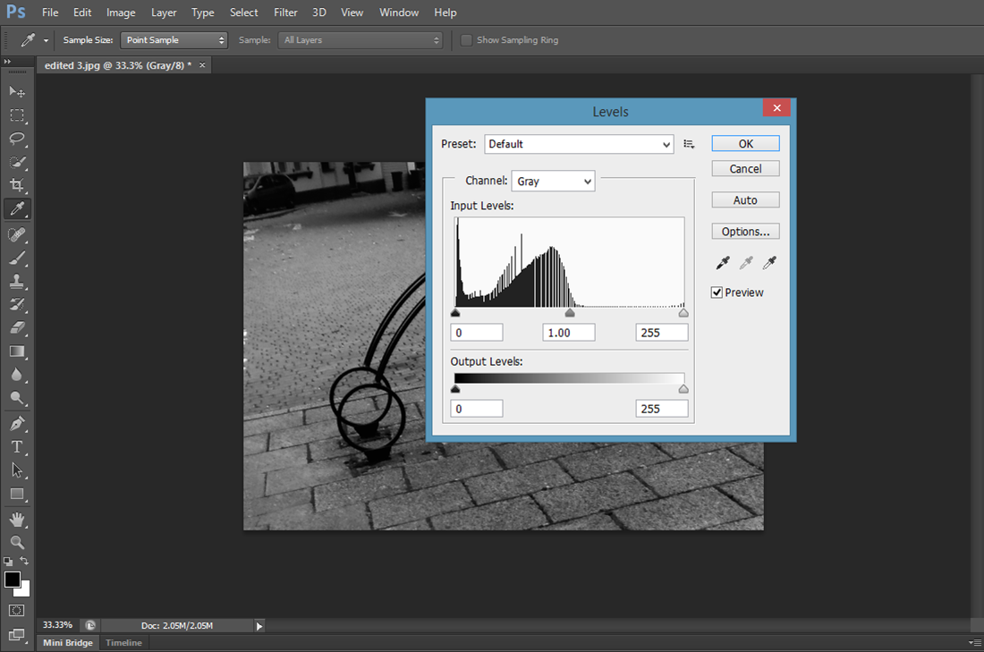
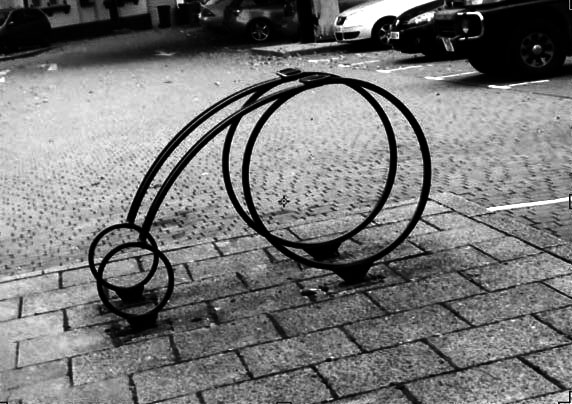
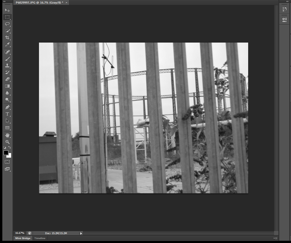
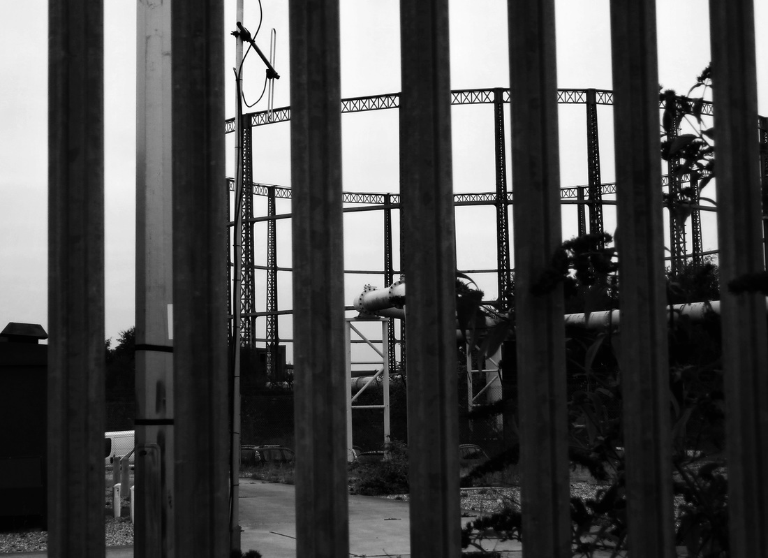
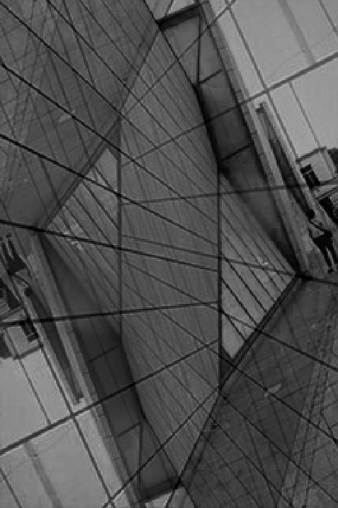
i took this photo because of the patterns and structures, I cropped and rotated it so the metal wiring was straight. to make the patterns and shapes stand out I made it black and white and I increased the contrast using the levels tool.
|
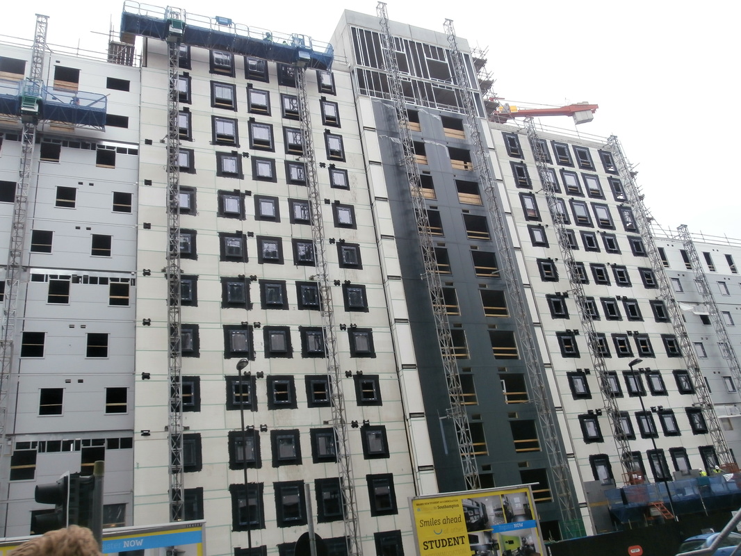
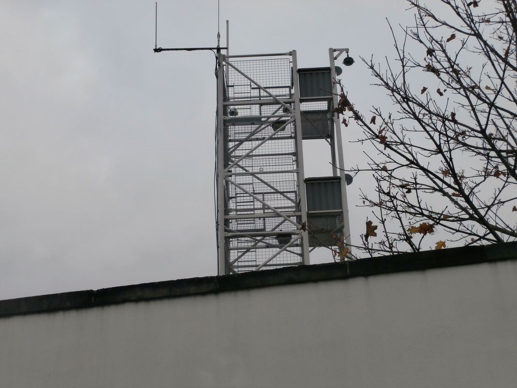
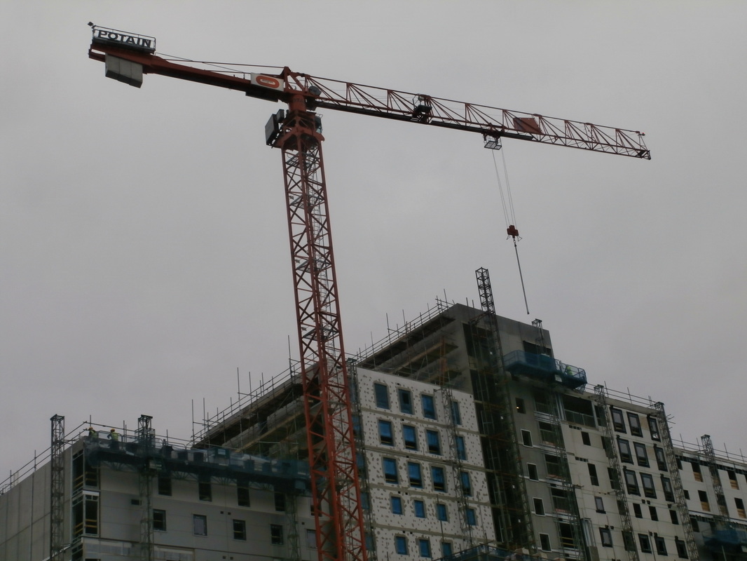
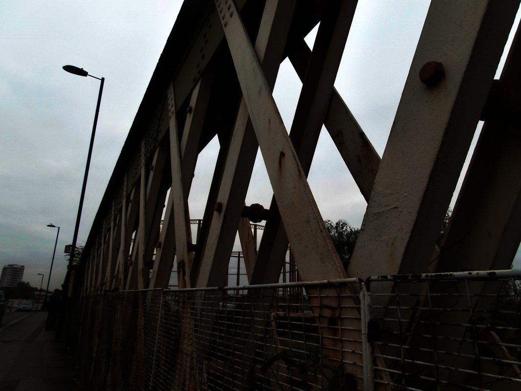
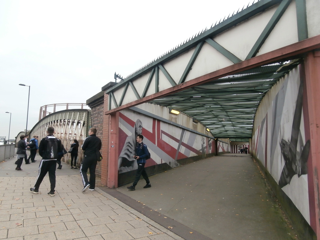
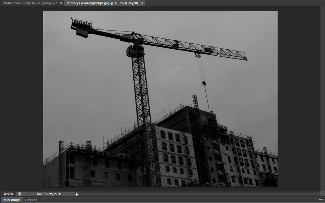
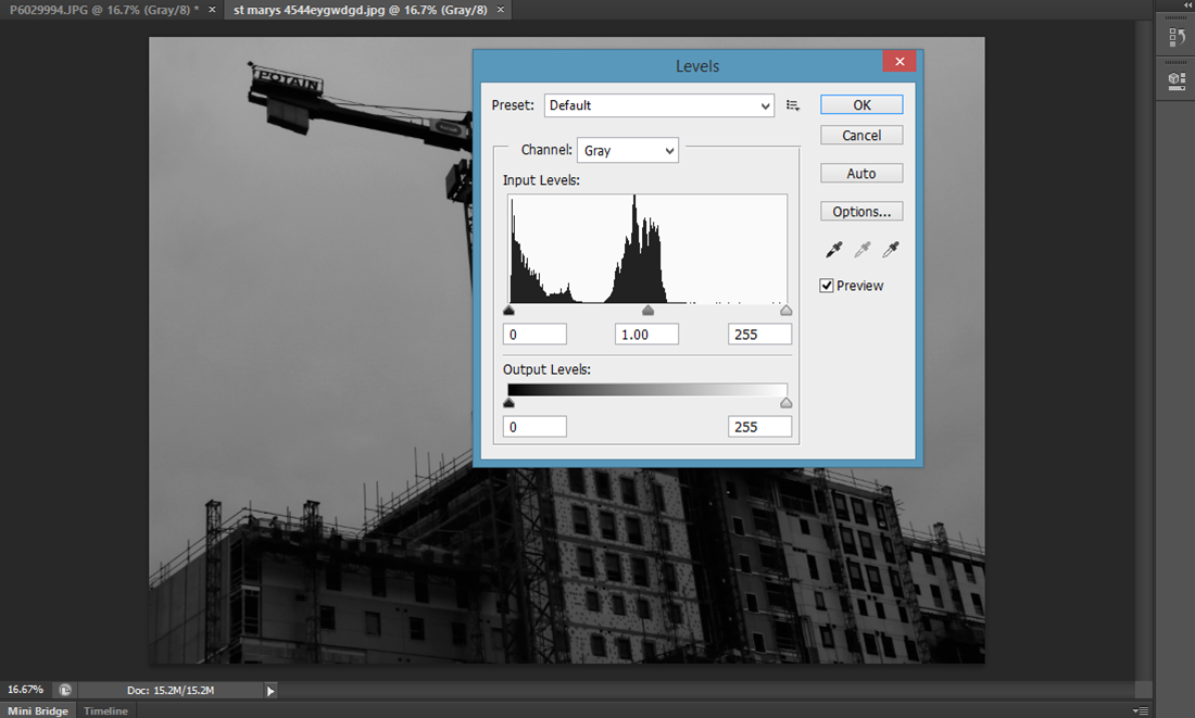
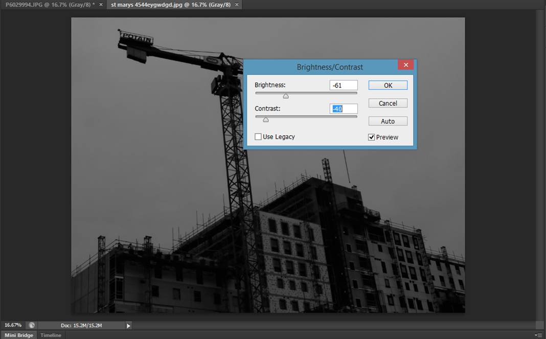
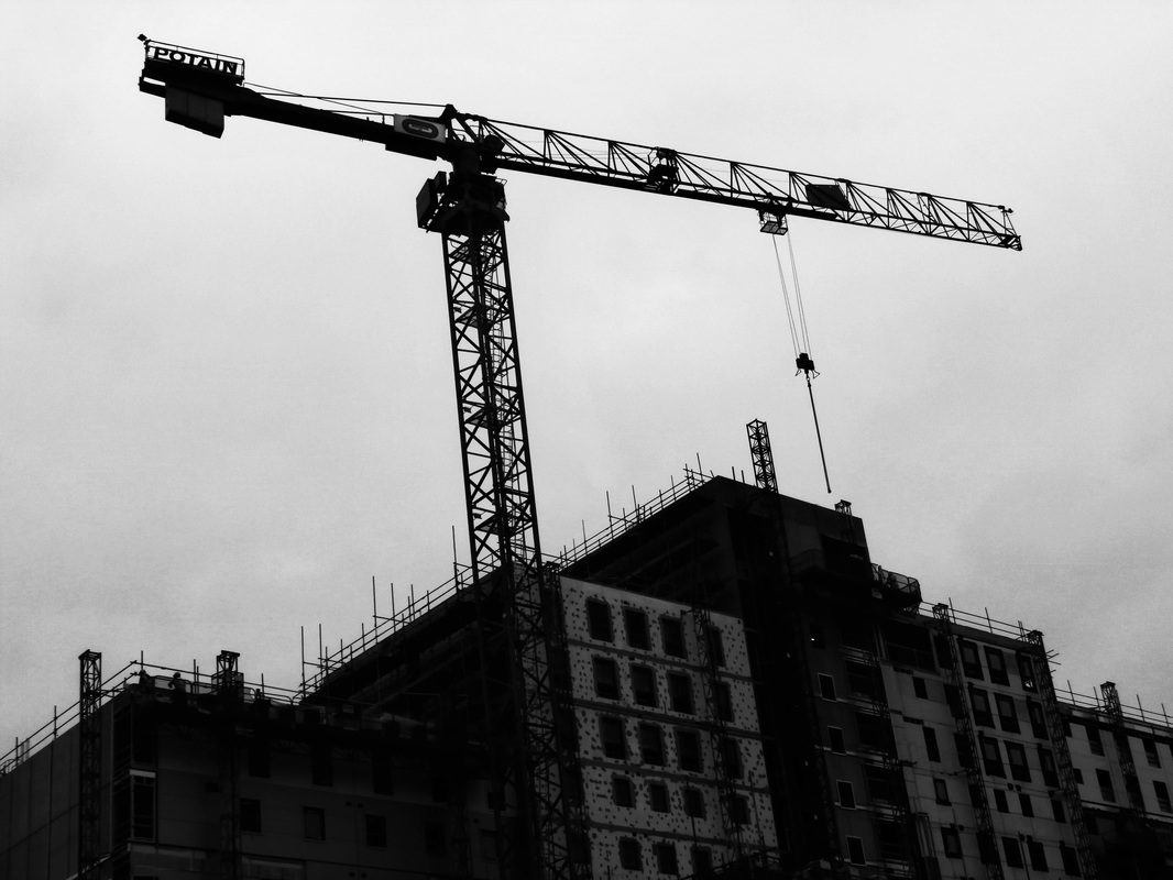
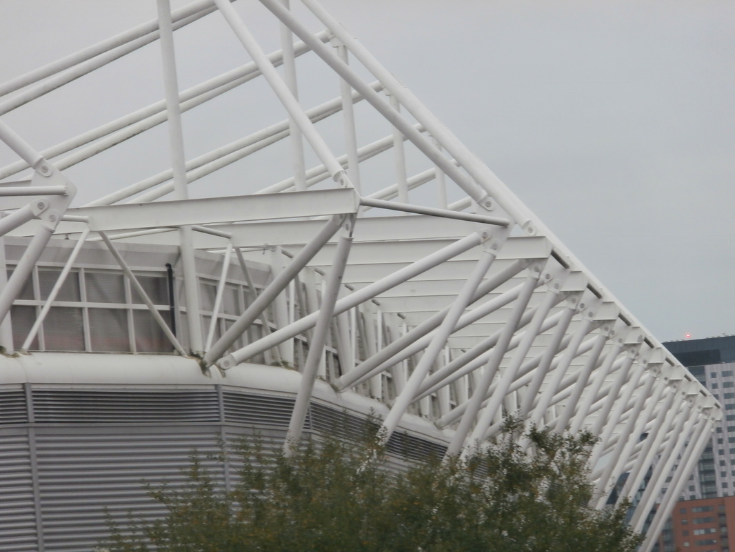
I took this photo of a crane at Southampton I then edited it to black and white, I also increased the brightness and contrast and changed the levels.
|
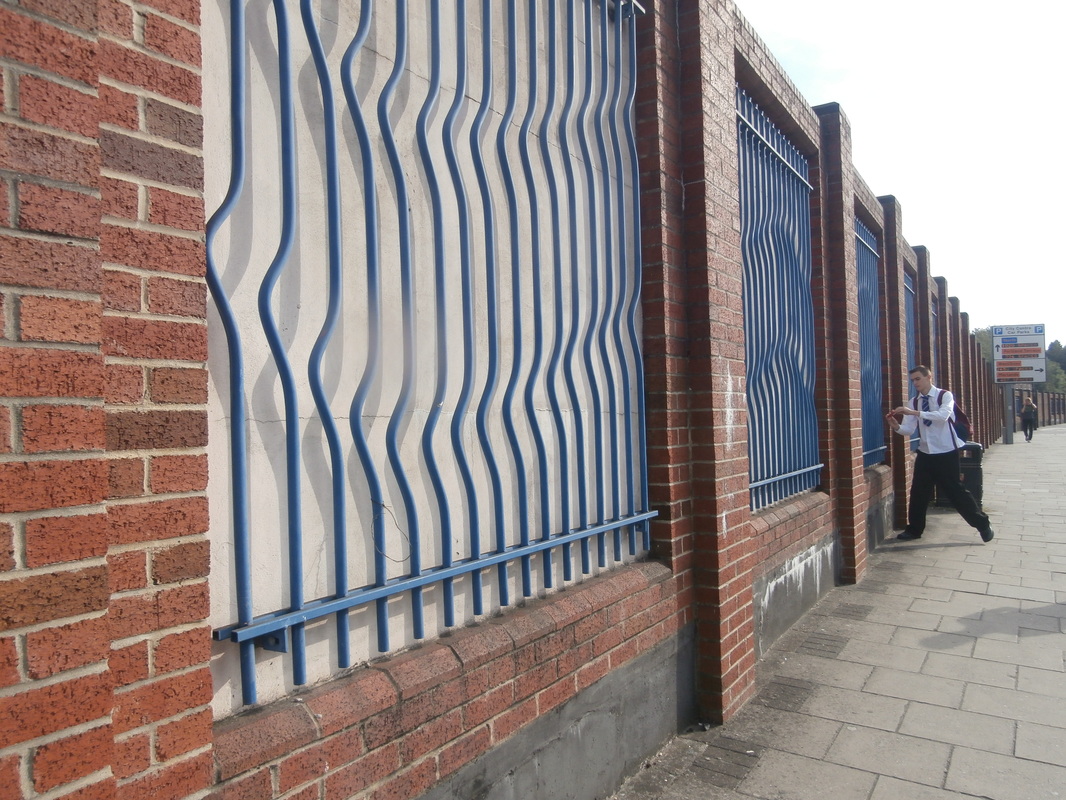
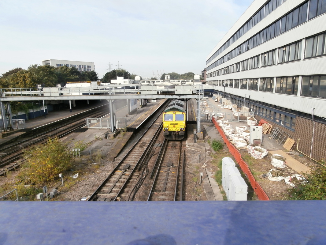
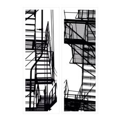
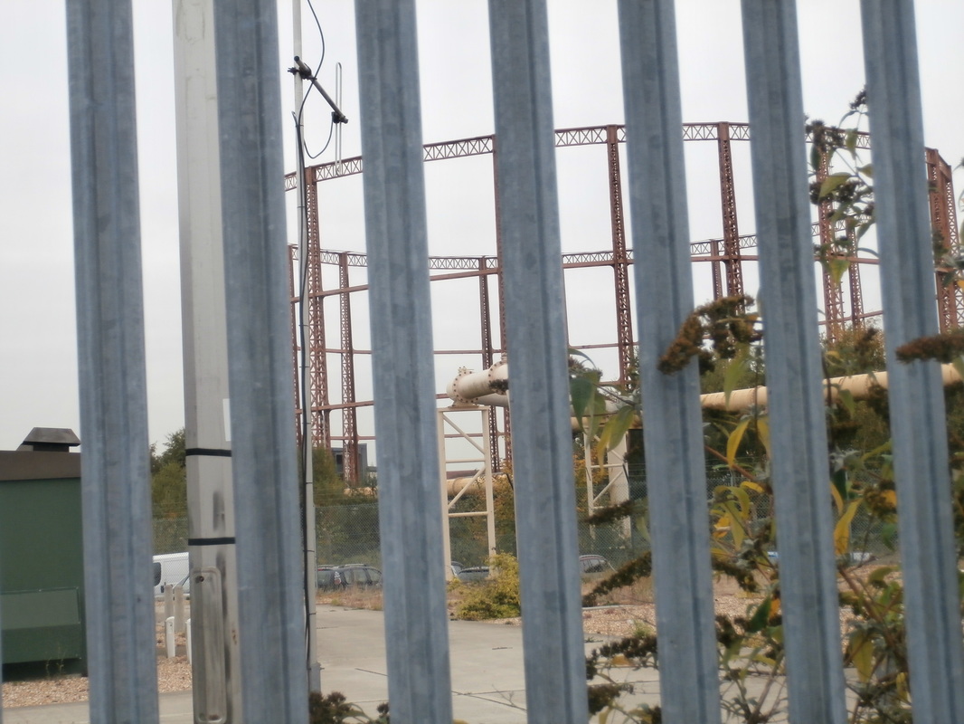
Pattern, Shape and Repetition- Photoshoot.
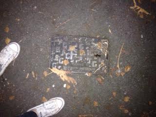
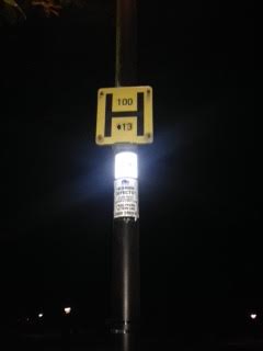
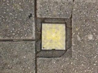
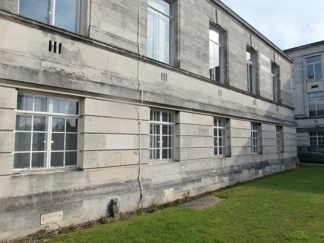
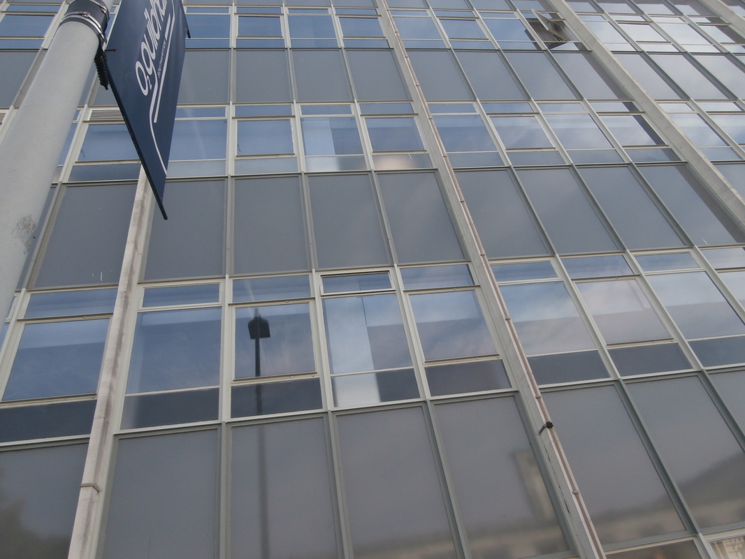
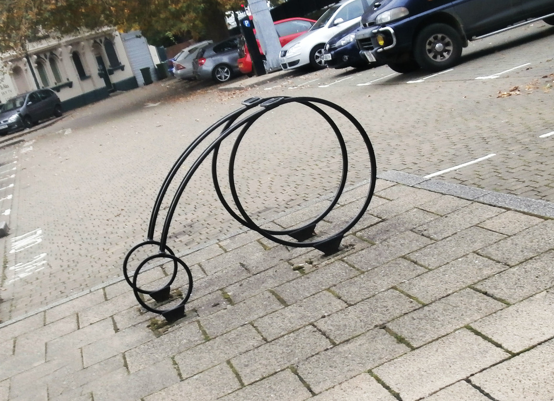
I took these photographs in Southampton, they are abstract buildings and signs,

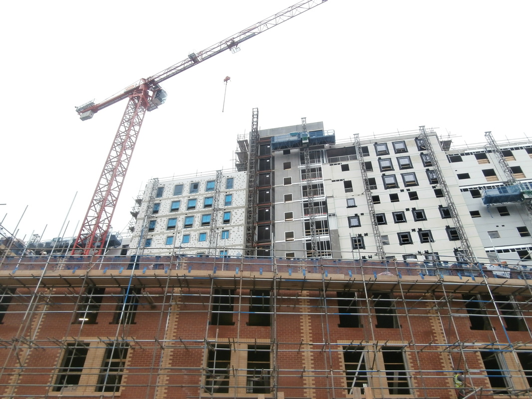

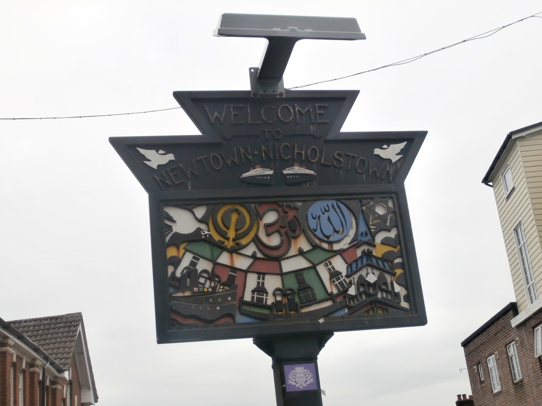

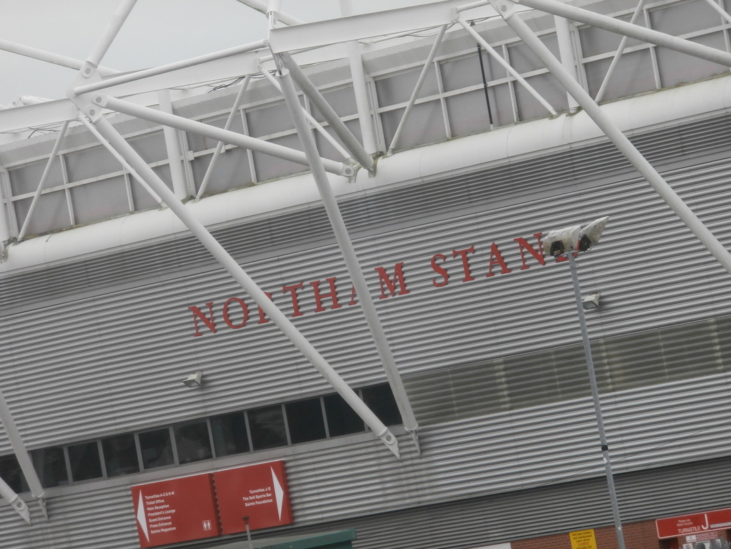

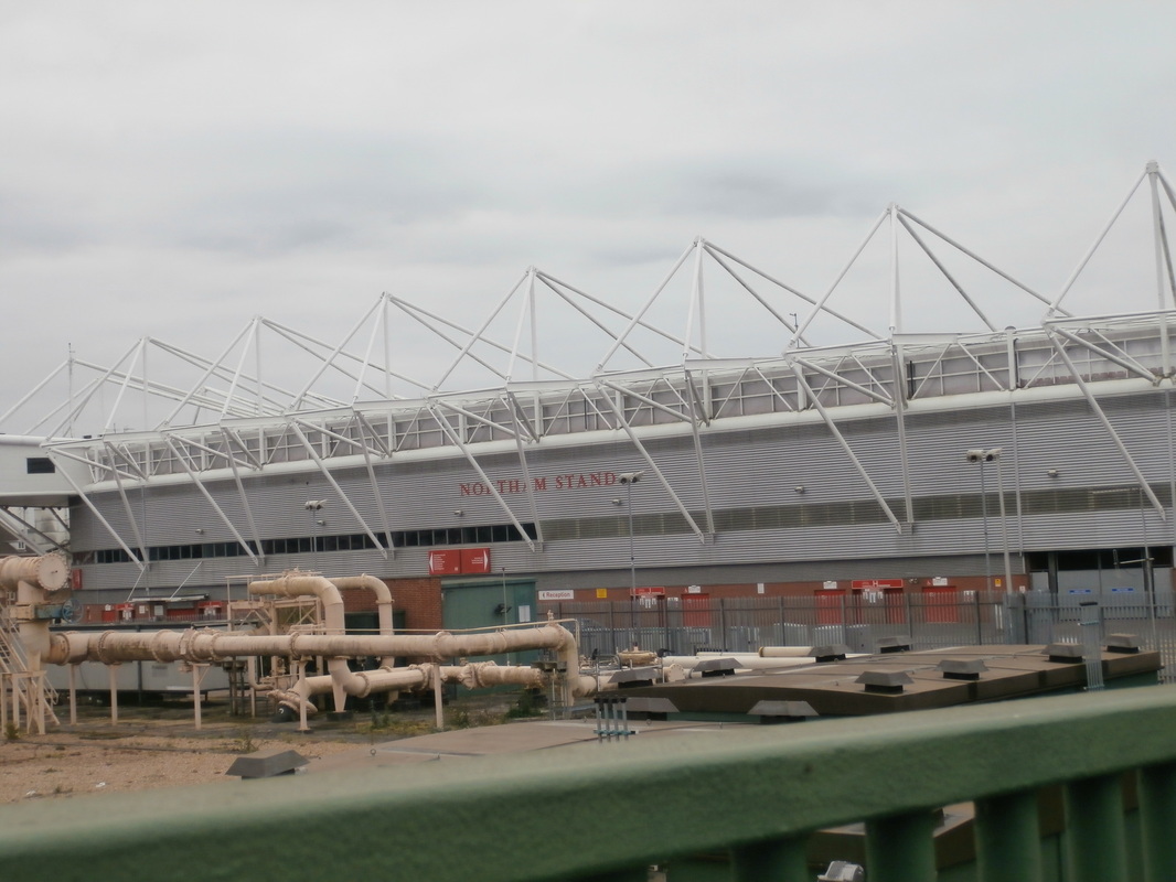
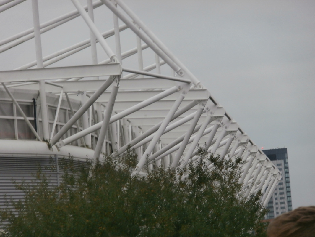


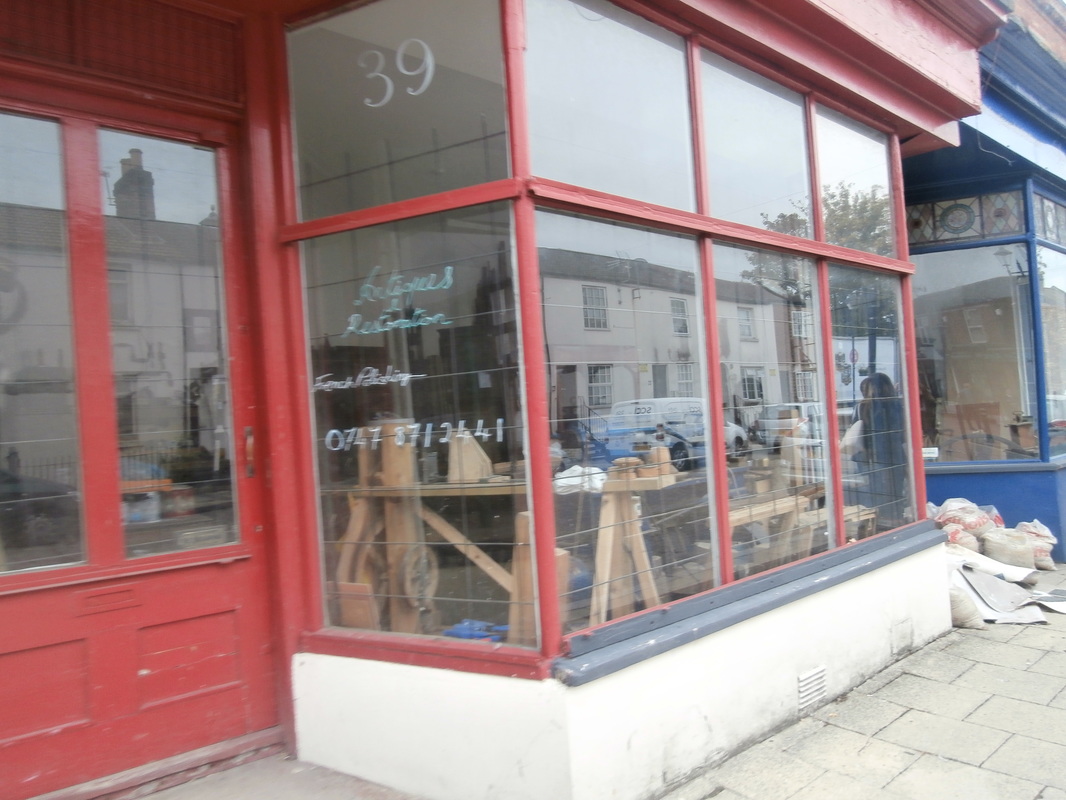
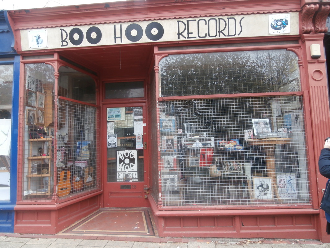


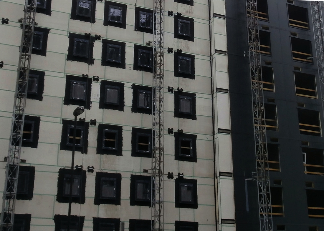
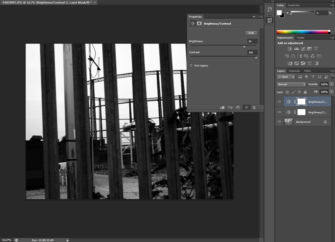
I took these photographs of abstract buildings in Southampton, I edited them by adjusting the brightness and contrast of the images. I lowered the brightness and put the contrast up to make the lines dark and bold. I also cropped the pictures so they were straight.
Selected Photographs- Photoshoot


To make these photos black and white I firstly changed the mode to grayscale, I then changed the levels to make the lines bolder, finally make the brightness higher and the contrast lower to make the patterns and lines stand out more.
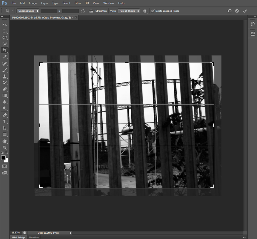
I firstly cropped and rotated this photo to make it straight and so that the main object was in the middle, I then changed the mode to grayscale to make the photo black and white, next I lowered the brightness and made the contrast higher. I also changed the levels to make the object darker.
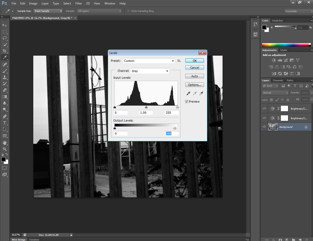
firstly I changed the mode to grayscale then I cropped the image. I then changed the levels to make the lines darker so they stand out more. I then changed the contrast so the background was lighter and the lines were darker.
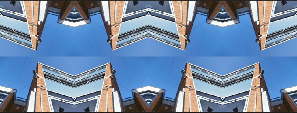
Refining my ideas
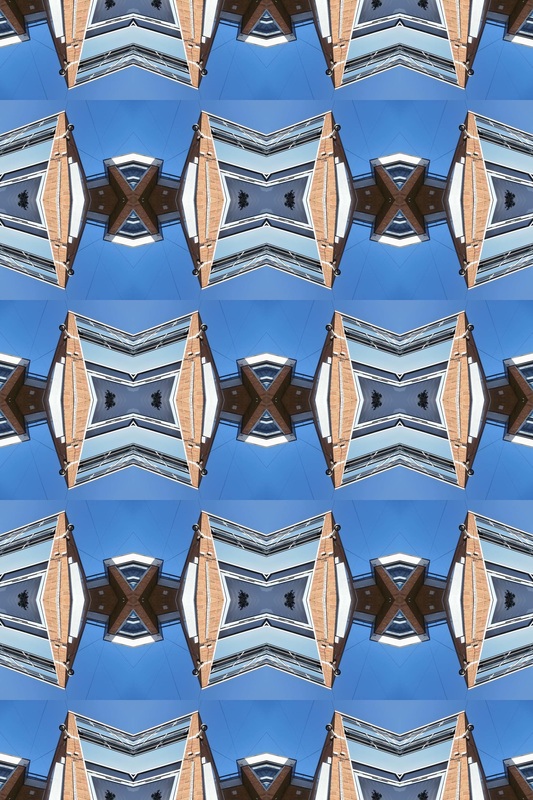
my most successful photos.


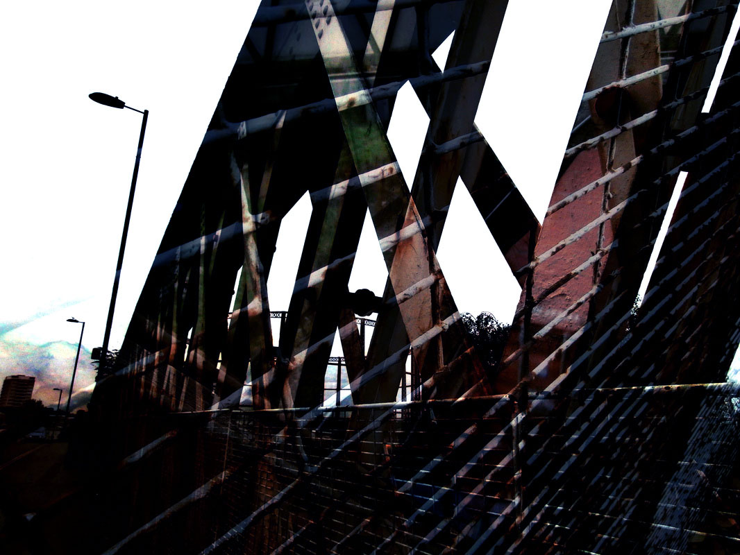
This is the photo I started with. I then duplicated the layer so I had two.
|
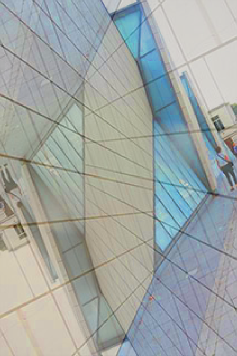
I then rotated the top one and made it so the top one was see through.
|
Then I lowered the brightness and the contrast of the photo. I also changed the colour balance so the triangle patterns stood out more.
|
this is the final piece, I like this one more than the original one as its more exciting and much more colourful.
|

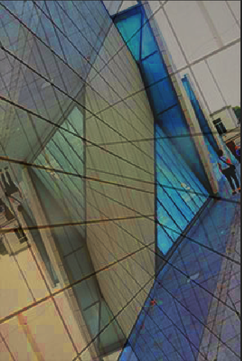
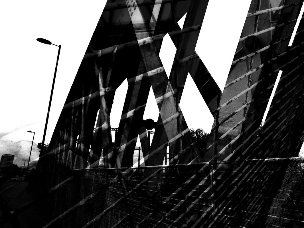
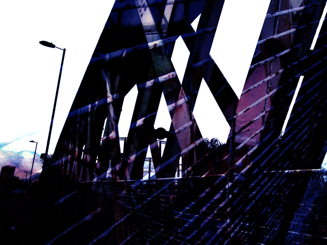
This is the photo I started with.
|

this is the second photo I decided to put over the top.
|
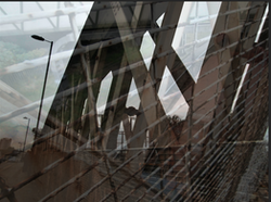
I then put the second photo over the top of the first, I faded it so that you could see the first one through it.
|
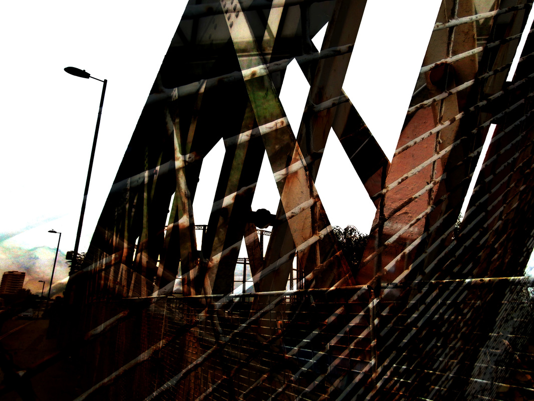
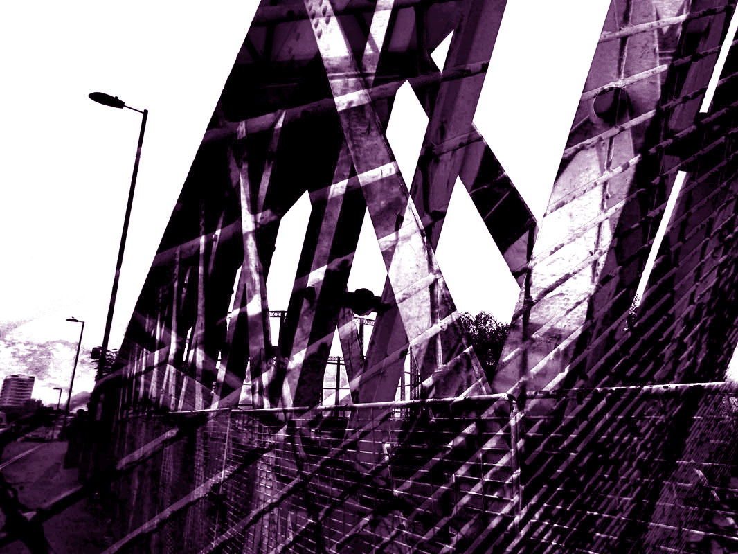
this is the final piece, I prefer it to the original one because its bolder more colourful and less boring, I like the light wiring going over the bridge.
|
|
|
|
|
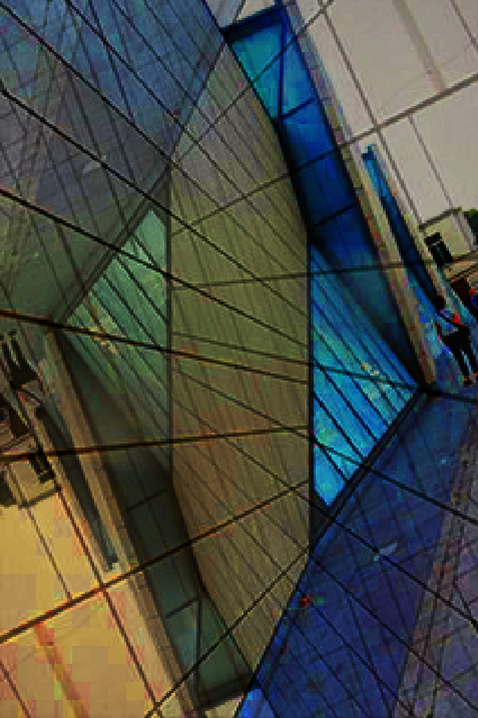
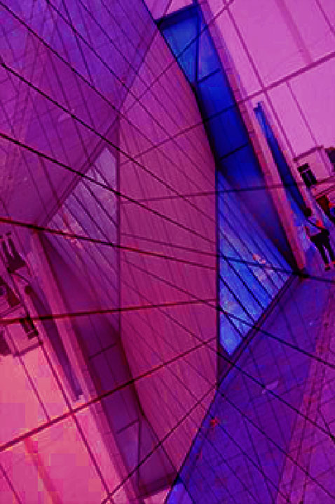
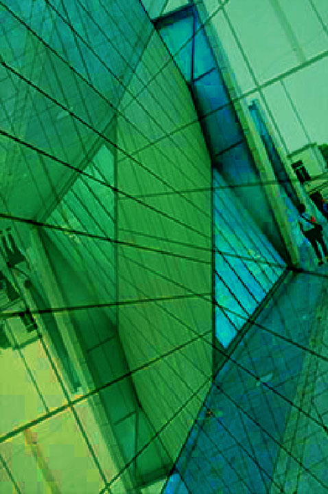
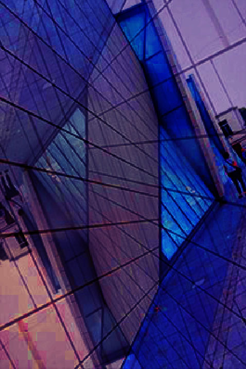
These are the four different colour photos.
|
|

|
This is my favourite final piece, I like it because the colours in the triangles stand out and where the photo is layered the lines look bold. I also think this is the most exciting photo as its bright and the brightness and contrast looks quite good.
|
